
 Matt Angelosanto
Written by Dylan Tientcheu✏️
Building great forms has always been considered a difficult task in modern web development. Forms on the outside are only a group of select boxes, text fields, radio buttons, and checkboxes. However, theming, validating, and making them intuitive for the user can quickly become frustrating.
Handling complex forms becomes a hassle for every developer, making it one of the major pain points in frontend development. The need for the ability to control multiple states and make them interact with one another while keeping them easy to fill gave birth to libraries like Formik, React Hook Form, Veevalidate, Vuelidate, FormKit, and others.
In this post we will introduce FormKit and how it can help us create powerful forms in Vue.js with validation, styling, and localization.
Contents
- What is FormKit?
- Creating forms with FormKit
- Validating forms
- Styling forms
- Internationalization (i18n)
- More cool FormKit features
What is FormKit?
FormKit is a powerful framework that helps develop any kind of form in Vue while keeping the developer experience top notch. The team behind FormKit is the same that came through with the popular VueFormulate library. If you are familiar with this library, you will remember their innovative approach to building forms in Vue.
VueFormulate offered developers a single component that heavily utilized props and slots to create form elements. This approach made writing, handling, and validating forms easy.
FormKit is an enhanced version of VueFormulate that offers developers the same benefits with a subtle touch of magic. Today, FormKit presents itself as a full-fledged framework created to help developers write great forms.
Creating forms with FormKit
To install FormKit on your project, you have to follow the first steps on FormKit’s installation docs.
FormKit offers two simple ways of creating forms: using the <FormKit/> component or generating the form from a JSON schema.
Creating forms with the <FormKit/> component
With FormKit, you are able to create highly controllable text fields, select boxes, and other form elements with a single FormKit component. This component comes with specific props that provide high customization of the input element you wish to add to your form:
<template>
  <FormKit
    label="Short word"
    type="text"
    help="Type any short word"
    validation="required|matches:/^[a-zA-Z]+$/|length:5"
    value="Hello"
  />
</template>
This single component is able to create other input types, similar to how HTML’s <input> tag uses various type attributes (i.e., <input type="text"> versus <input type="checkbox">).
This approach is powerful because not only does it provide developers with fewer APIs to learn, but it also does so in the most intuitive manner. The FormKit component provides explicit props needed to build forms and is able to pass to the rendered HTML input every attribute (prop) you need them to exhibit.
In most cases in which you need your inputs to behave like a form (or multiple forms), the <FormKit/> component is able to become a wrapper that actively collects all the values from children FormKit components. It uses the name of each input as the property name in the resulting data object. This wrapper also enables you to get or edit form values as you would do with the v-model attribute attached to any input in Vue.
To do this, simply wrap your inputs in a <FormKit type="form"> in case you need a global form, and <FormKit type="group"> if you’d like to group part of a form. This greatly helps in making form elements interact with each other, resetting the form state or submitting to an API, which in vanilla Vue may become inconvenient for the developer, since they may have to listen multiple variables from multiple sources.
The wrapper will also invalidate the whole form if a single input isn’t valid, making it impossible to submit:
<FormKit
  type="form"
  submit-label="Login"
  :errors="['No server.', 'More errors here']"
>
  <FormKit type="email" label="Email" />
  <FormKit type="password" label="Password" />
</FormKit>
Generating forms from a schema
Dynamic forms are a feature in high demand in form handling. Developers often need to create forms that may follow a custom structure that hasn’t been pre-specified, or whose answers and validations could be created on the fly.
FormKit offers this great ability using the <FormKitSchema> component and its :schema prop:
<script setup>
const schema = [
  {
    $formkit: 'email',
    label: 'Email address',
    validation: 'required'
  }
]
</script>

<template>
  <FormKit type="form">
    <FormKitSchema :schema="schema" />
  </FormKit>
</template>
FormKit’s JSON schema is extremely powerful. It ranges from the creation simple forms as the one above to the most complex ones. Schemas support top notch features like conditional logic, boolean operators, loops, slots, and data scoping, enabling you to make your generated forms as custom as you want:
<FormKitSchema
  :schema="[
    {
      $formkit: 'email',
      label: 'Email address',
    }
  ]"
/>
The code above creates a single email input. This could be extended with validation, passwords, interactions, and much more.
Validating forms with FormKit
FormKit helps you validate your forms easily by using and combining more than 20 validation rules prewritten for your forms. These rules have various ways to be used, so the developer can choose what seems most appropriate to their project:
<!-- validation as string -->
<FormKit
  type="text"
  label="Number"
  validation="required|number|between:0,10"
  validation-visibility="live"
  help="Enter a number between 0 and 10."
/>

<!-- validation as array -->
<FormKit
  type="text"
  label="Phone"
  placeholder="xxx-xxx-xxxx"
  :validation="[['required'], ['matches', /^\d{3}-\d{3}-\d{4}$/]]"
  validation-visibility="live"
  :validation-messages="{
    matches: 'Phone number must be formatted: xxx-xxx-xxxx',
  }"
/>
In FormKit, rules are extensible, customizable, and require no third party library to handle validation. Creating custom rules for your forms is as easy as writing a function that gets a value as argument, and returns a boolean according to the conditionals inside:
// ./validation-custom-rules/yes-rule.js
// ensures that the value is always yes

export default function yes(node) {
  return node.value === 'yes' || node.value === 'YES'
}

// main.js ---------
import { createApp } from 'vue'
import App from './App.vue'
import { plugin, defaultConfig } from '@formkit/vue'
import yes from './my-custom-rules/yes-rule'

// prettier-ignore
createApp(App).use(plugin, defaultConfig({
  rules: { yes },
})).mount('#app')
Validation in FormKit has been simplified to accompany developers in writing good forms, but it was built to scale properly while keeping the simplicity we enjoy. In case your forms are getting more complex and require more custom rules and bigger interactions between fields, FormKit combined with Vue’s insane component modularity can help us create complex forms and states while keeping the code simple and easy to understand.
Styling forms with FormKit
Styling native forms is not easy. Checkboxes, text areas, text fields, and radio buttons are all <input> fields but can’t be styled the same way. FormKit provides a base theme called Genesis, which is open source and can be adapted to your project.
FormKit also does more by providing simple yet robust styling facilities, which we will discuss in the sections below.
Custom classes
Most frontend developers have a design or theme system to follow, and FormKit allows that by offering multiple ways to add classes ordered by precedence.
As you may know, having a single component to represent a whole input field can be cumbersome to style, but FormKit makes it easy by providing very specific props, options, and functions for providing custom classes to the right element. Classes can be modified for all sections using any of the following methods (from highest to lowest specificity):
- The
{section-key}-classprops (most specific) - The
classesprop - The
classesconfiguration option - The
rootClassesconfiguration function (least specific)
Outer attributes
These are attributes that developers can use to style the input to help provide better feedback to the user on how it is being filled. data-type , data-invalid, data-multiple, data-complete, and data-errors are styled in CSS as simple HTML attributes:
<style>
[data-invalid] .formkit-inner {
  border-color: red;
  box-shadow: 0 0 0 1px red;
}

[data-complete] .formkit-inner {
  border-color: red;
  box-shadow: 0 0 0 1px green;
}
[data-complete] .formkit-inner::after {
  content: '✅';
  display: block;
  padding: 0.5em;
}
</style>
Schema styling
Schemas can be styled as much as the form component. They enable attributes and props binding, making it easy to add classes and properties on your forms.
In addition to the above, FormKit also accepts appending and resetting classes that help bring your theming to the next level by enabling you to add and remove classes on the fly.
As displayed on the code snippets above, the classes in FormKit can be bound just like in Vue, allowing more malleability in styling.
Styling with Tailwind CSS
In case you are using Tailwind CSS, not only does FormKit support the multiple inline styles you need, but it also provides a package (@formkit/tailwindcss) to help you write cleaner code with templates providing the ability to theme your forms in a configuration file. The styling with Tailwind guide is available on the FormKit docs.
Internationalization (i18n)
Internationalization is the process of adapting software to different languages and regional peculiarities.
At the time of writing, FormKit ships with 23 different locales that can be used, interchanged, overridden, and even combined with well-known libraries like vue-i18n.
Setting additional and active languages on FormKit works as follows:
import { createApp } from 'vue'
import App from 'App.vue'
import { plugin, defaultConfig } from '@formkit/vue'
import { fr, en } from '@formkit/i18n'

const app = createApp(App)
app.use(
  plugin,
  defaultConfig({
    // Define additional locales
    locales: { fr, en },
    // Define the active locale
    locale: 'en',
  })
)
app.mount('#app')
These languages apply to prewritten FormKit rules and messages. In the event that you have your own messages for custom rules, you can add combine them with the vue-i18n library to provide the appropriate locale in you Vue SFCs.
More cool FormKit features
Plugins
Plugins can be used to extend FormKit’s functionality. They are functions that take a FormKit element (node) as argument and tweak it. These functions are called each time a node is created and when a plugin is added. Examples of plugins usage can be viewed on the example page.
Built-in debounce
Debouncing is a programming practice used to ensure that some heavy tasks do not fire so often, that they reduce the performance of the code.
FormKit provides debounced inputs on demand, enabling developers to create performant forms by adding a single prop :delay="<time in milliseconds>" in which validations can be performed with a delay.
Built-in error handling (including server-side)
FormKit is able to gracefully handle your validation errors and flow them to the user in a very comprehensive manner. Now, one may need to handle all or part of the validation in the server and return them to the frontend. These errors can be added to the form using the errors or input-errors prop, or the node.setErrors() or $formkit.setErrors().
Server-side rendering
FormKit integrates flawlessly with Nuxt.js and gives access to everything it has to offer along with all of Nuxt’s features.
A powerful schema
FormKit coins itself as a framework for building forms because it offers a very flexible form handling system. A schema is an array of FormKit node objects, and each object corresponds to an HTML element, a component, or text node. This schema is able to reference existing Vue variables and render any markup or component with editable attributes and props.
Low-level functions (FormKit Core)
FormKit Core contains almost all of the low-level functions in FormKit. This enables lower level input handling by providing developers with a well-defined tree structure of the components inside the form. FormKit Core functions help edit, traverse, listen, and track the state of the form. This is considered more advanced, but can get useful when you need to have a modular code structure.
Comprehensive documentation and FormKit playground
FormKit has great documentation, and most of the API is well documented and structured. The docs provide a full referenced search functionality, which helps you find almost everything you need.
The FormKit playground enables you to play with the API as much as you want. You have the ability to tweak themes, edit the global config file, and create multiple components utilizing FormKit when needed.
Conclusion
Libraries like FormKit are game changers; they offer a simple solution to solve the major form problem in modern web development, and let developers have a good time going through what would otherwise be a tedious task.
FormKit is mind blowing in the way that it both supercharges your development process and renders extremely powerful forms to users.
In case you need a deeper comparison, FormKit has done a good job comparing itself to other form libraries in Vue’s ecosystem.
Experience your Vue apps exactly how a user does
Debugging Vue.js applications can be difficult, especially when there are dozens, if not hundreds of mutations during a user session. If you’re interested in monitoring and tracking Vue mutations for all of your users in production, try LogRocket.
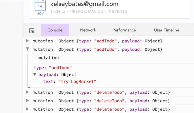
LogRocket is like a DVR for web and mobile apps, recording literally everything that happens in your Vue apps including network requests, JavaScript errors, performance problems, and much more. Instead of guessing why problems happen, you can aggregate and report on what state your application was in when an issue occurred.
The LogRocket Vuex plugin logs Vuex mutations to the LogRocket console, giving you context around what led to an error, and what state the application was in when an issue occurred.
Modernize how you debug your Vue apps - Start monitoring for free.


