 Matt Angelosanto
Written by Josh Collinsworth✏️
Many developers, even among the most seasoned senior engineers, balk at the idea of laying out and styling pages on their own. CSS is a unique programming language (you could say it’s in a class of its own) and requires at least some overlap of technical know-how and design fundamentals.
I don’t believe developers need to be designers. But I believe developers can learn to build functional, quality layouts with knowledge of design principles.
I also firmly believe that a boring, intuitive form will be a better user experience than a flashy, visually impressive form 99% of the time. So, if you’re a developer faced with form design, fear not.
And, just as a little primer, when I say “design,” I mean both visual and structural. We’re going to cover some aesthetic fundamentals, yes, but it’s crucial when talking about forms to address some behind-the-scenes user experience details as well.
But first things first: let’s start with my favorite, and perhaps the most important principle of all.
Hierarchy design in CSS
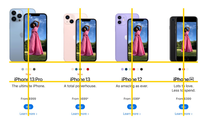
Hierarchy is being able to tell, at a glance and with no conscious effort, what’s important and what’s not. Take just a quick second to glance at this layout (from the Netlify homepage):
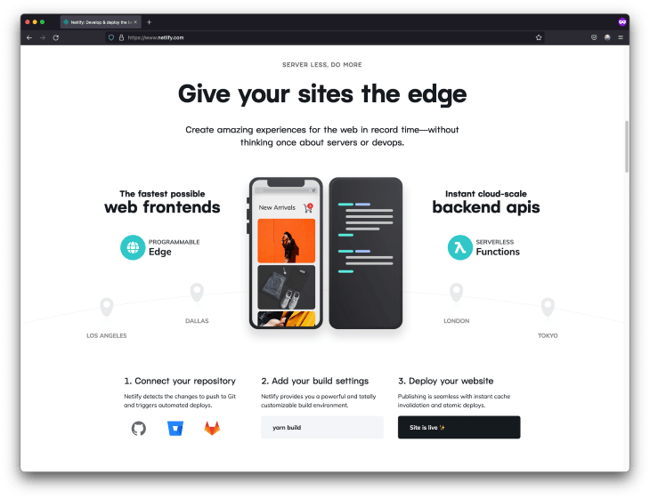
If you gave that image only a glance, you probably took away the most important point — which is the biggest and most noticeable text and images.
Hierarchy is a technique employed everywhere. Glance at the front page of a newspaper, or open to a random spread of a magazine for just a second, and you’ve likely already processed whatever the more prominent items are. Even if you scroll quickly through most blog posts, you can probably get an accurate sense of the sections, and which points are the most important.
That’s how you know when you’ve done hierarchy well; you don’t even need to read it to see it. Take, for example, the webpage above re-done as a simple wireframe:
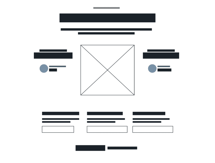
Even having no idea what the words are — even if you had looked at this first without seeing the real website image above — you still know intuitively that the most important thing is that large image and heading on top, followed by the two slightly smaller headings below it on either side of the image, and, finally, the three points aligned near the bottom.
To distill hierarchy to one directive: the relative size of an element should be directly correlated with its importance.
Size isn’t the only way to portray hierarchy, of course; a standout color, a bolder font (literally or figuratively), and prominent placement are other factors, just to name a few. (This is why headings are often bold and generally in a different font family than the body text.) But typically, when it comes to hierarchy, size is king.
Applying hierarchy to forms
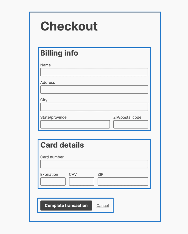
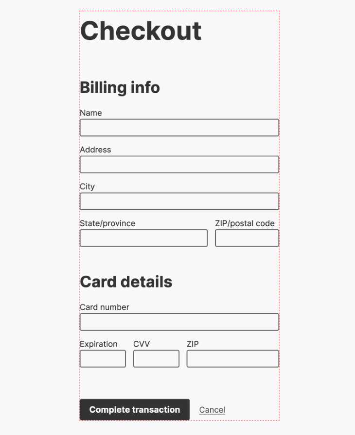
OK, so hierarchy makes sense for a website, but how do we apply it to a form? Well, forms aren’t actually different from other layouts. All we need to do is ensure what’s important stands out relative to less-important things. Take a checkout flow, for example:

Even though that design is minimalist, you can still see what’s important at a glance. In order of hierarchy:
- We’re on the checkout page
- There are two distinct sections: billing info and card details
- We can finish up by clicking the complete transaction button
Here’s a CodePen demo, if you’d like to look at the original markup and CSS styles.
Contrast, repetition, alignment, and proximity
While they make for a somewhat unflattering acronym, the four principles of contrast, repetition, alignment, and proximity are core to good form design. Let’s quickly break each one down:
Contrast
Items that are different should look different. Visual interest is generated by something that stands out from what’s around it. (Hierarchy, in fact, is a type of contrast.)
Typically, contrast isn’t our primary concern when dealing with forms because we’re trying to make them useful and intuitive, not flashy. But it’s applicable where we might separate sections from one another, inject some extra information, or add a call to action.
In our example above, the contrast is created mainly through the use of headings and spacing.
Put another way: contrast is when the pattern is broken. So spacing, size, weight — really, anything — can create contrast. It doesn’t have to be literal color or imagery.
Speaking of patterns…
Repetition
Like a good song, a design is enjoyable when it’s consistent. As each verse and chorus are similar to one another and as the beat follows a predictable rhythm, similar items on the website should reflect one another.

This principle is bread and butter when it comes to forms; the labels, inputs, selects, buttons, and other form elements should be predictable in both appearance and positioning. They should look like each other, and be consistent, like the beat of a song.
Alignment in design
Elements in any design seem related and cohesive when there’s vertical and horizontal alignment between them.
The type of alignment is less important than whether it’s there at all, but when in doubt, it’s hard to go wrong with left-aligned (at least in left-to-right languages).
It’s important to carry this principle through to forms as well. When elements align with one another, they have greater cohesion.
Proximity
The human eye groups things by their proximity to one another. The less space between items, the more they seem related. In the below screenshot, the items within each column seem more closely related to one another than they do to other columns because there’s greater space between columns than within.

This principle works just the same in forms. We want our users to tell what’s a pair, what’s a group, and what’s a section, intuitively and instantly, without the need to spell any of it out. Proximity works perfectly for that job.
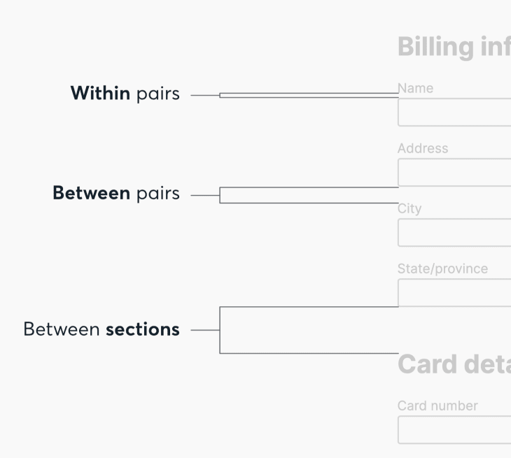
The more closely related two things are, the closer they should be visually. Put less space between things to relate them, and more to separate them. That’s really all there is to it.
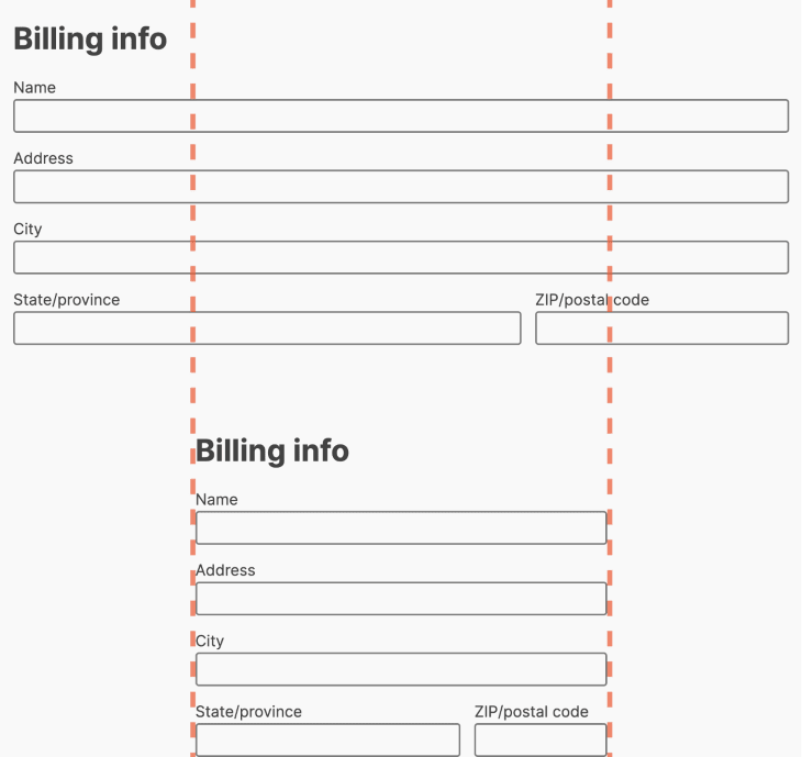
Also: as shown above, be consistent with spacing. Just as you should only have a few specific colors you use in most designs, you should only have a few specific gap sizes you reuse throughout your site or app.
One main gap size (like the one between pairs above), plus maybe two to four more where larger or smaller gaps are needed (like the gaps between pairs and sections above) should do the trick. Not to belabor the metaphor, but this is often referred to as “rhythm,” because elements have a predictable amount of space between them, just like beats in music.
I like to use rem units because they scale accessibly with the user’s preferred font size, so my main gap size is generally 1rem.
Finally, note that the exact size difference between steps doesn’t matter, as long as each step is noticeable and distinguishable from the ones before and after.
Typically, this means every step up should be at least about 30–60% bigger than the step before, but again: as long as it’s big enough to notice the difference at a glance, that’s the important part. (Tip: you can apply this rule to font sizes as well when making some text larger or smaller.)
Using white space in design
To focus a user’s attention, hierarchy is only half of the equation. The other half is giving the content the space it needs. Just as you probably wouldn’t cram as many things as possible into every inch of your living space, you shouldn’t try to fill every available pixel on a screen.
White space naturally draws the eye to what’s inside it. (Negative space, that is. The specific color is unimportant; backgrounds just usually happen to be white.) Too many things in too little space creates tension and makes the space harder to use. Space makes whatever is centered in it nicer to experience. It makes the content feel important and visually focuses it.
That being the case, there are several important CSS tricks we can implement in our forms.
Stay away from the edges when using CSS
If an element (form or otherwise) is visibly near or touching the edge of a container, it will create tension and look worse. Always provide adequate space and don’t forget that the edge and container here could be the screen itself.

Implementing this could be as simple as adding some padding to the body or main element, or to the form itself.
(Why padding and not margin? Because if we ever changed the background of the form, we’d probably want that background to extend to the edge of the screen, and not end at the edge of the inputs.)
Don’t let form fields get too wide
When forms look bigger, they seem like they require more info. Most forms don’t need to get much wider than they’d be on a mobile screen.
Despite the popularity of memes insinuating otherwise, there are actually plenty of easy ways to center things in CSS these days. Flexbox and CSS grid both make it trivial, but this CSS ought to work well out of the box, too (no pun intended):
form {
  width: 100%;
  max-width: 32rem; /* Or whatever width you prefer */
  margin: auto;
}
Note that while 32rem isn’t a magic number here, it isn’t random, either. The ideal line width for readability is about 45–75 characters wide, which — because one rem is wider than most characters — works out to be somewhere right around 30rem, give or take. (I go with 32 because I like keeping things in exponents of two, for no really good reason.)
Provide space inside inputs, too
Browser defaults are pretty tight, and a little extra padding around the edges can make all the difference.
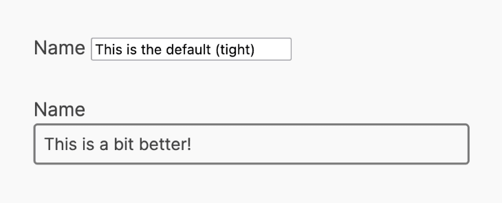
This is easily accomplished with a little CSS. While we’re at it, we should probably apply the same style to buttons.
Also know that inputs and buttons don’t inherit font-family or font-size by default (you might notice input text seems a bit small), so this is a good little snippet for just about anything with forms:
input,
button {
  padding: 0.5rem;
  font-family: inherit;
  font-size: inherit;
}
Now that we’ve thoroughly covered using space effectively in our forms, let’s talk about some other aspects of form design.
Designing forms with CSS
It’s tempting to try applying fancy new designs to old interfaces. Who wants to look at the same old form elements they’ve seen a million times?
In the world of user interfaces, however, clichés exist for a reason. They’re good, actually. They even have their own name: affordances.
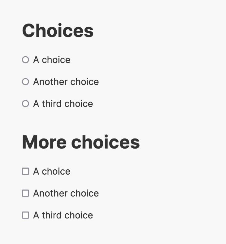
An affordance is something a user can reasonably expect; a norm, or a standard. Some examples:
- Underlined text is usually a link
- Text inside a colored-in box is usually a clickable button
- Radio buttons are round, and checkboxes are square
- A cog icon indicates a settings menu
Even things that seem like universal truths, such as headings being larger than normal text or navigation placement in the site header, are affordances. Going against these conventions makes our designs unique, yes, but at the cost of making our site harder to use.
You could make round checkboxes or square radio buttons, and they might look really cool. But it would confuse users, and that’s enough to override the aesthetic merits of any design.
Similarly, you could make red the success color and green the warning color in your design system, but that goes directly against convention. Unless you have a strong reason to do so (looking cool or different doesn’t count), don’t subvert norms.
All this said, however, there are some defaults we would do well to avoid.
Better defaults with HTML
HTML is responsive and accessible by default; headings have a hierarchy, paragraphs are spaced consistently, and (with a couple of notable exceptions), elements scale to the viewport size automatically.
We should be wary of wrestling too much control away from these defaults. However, there are several improvements that can be made.
font-size and line-height
While I might have disagreed when I was younger, I find the browser’s defaults for font-size and line-height both to be a tad too small.
The default font-size is 16px, though it’s important to note that you can’t always count on that being the baseline, as users can set their own default (or minimum) font size in their browser.
I like to bump the font size up to 18px in most cases, as I find it more readable on most screens. Rather than setting a static pixel value, it’s better to adjust the base by rem units.
If you didn’t know, rem means “root em.” 1rem is equal to whatever the default font size set by the browser or user is. In most cases, 1rem = 16px, but again, the user can adjust the defaults. So if the user prefers a minimum font size of 22 pixels, for example, 1rem = 22px.
By using rem units, no matter what the user’s font size is by default, we’ll bump it up by a little bit. Plus, using pixel values still has pitfalls for accessibility.
The browser default line-height of 1.2 is also a little low. What looks good will depend on the font family (some benefit from more spacing than others), but I like to bump it up to 1.4 to 1.6 in most cases.
body {
  font-size: 1.125rem; // 18px, usually
  line-height: 1.5; // Unitless! 1.5x the font size
}
Notice we’re not specifying any unit for the line-height. This, too, makes the CSS more flexible and accessible.
All this talk about type may not sound specifically relevant to forms, but good typography is the heartbeat of good design, and design directly helps conversions. You might also be surprised how much these rules cascade down and have a noticeable impact on form elements.
width and max-width
By default, input elements have a static width that can make them hard to align well. Setting width: 100% on input elements is a good start to solving this problem. We can also make judicious use of div wrappers with either grid or Flexbox applied to get things lined up properly, where more than one field needs to be on the same line.
Functional design in web development
Steve Jobs is often quoted as saying,
“Design isn't just what it looks like and feels like — design is how it works.”
Nowhere is that more true than in form design. Something that looks nice but functions poorly is inconvenient at best, and exclusionary at worst.
I’m going to veer into the weeds and discuss important principles of form design that are not visual, but that are critically important for both user experience and accessibility.
Always use semantic HTML
This is the single most important thing about building web forms. In most cases, you should use a <form> tag (even a simple email sign-up or login page is technically a form, after all) and use the proper form elements inside it.
Accessible form design is an in-depth topic, so it’s too much to cover in the scope of this article. Where questions arise, default to existing HTML tags (don’t try to add interactivity to a <div>, for example), and follow a guide, such as these tips for designing accessible forms, or this more in-depth forms accessibility tutorial from the W3C.
I’ll touch on a few key highlights now.
for and id attributes
Every input should have a corresponding label, and that label’s for should match the input’s id.
That’s harder to say than show, so here’s a simple example with a text field:
<label for="first-name">First Name</label>
<input id="first-name" type="text" />
The for="" matches the input’s id="". What the id actually is doesn’t matter (as long as it’s unique on the page); only that they match up. This serves two very important functions:
- It tells assistive technologies (ATs) such as screen readers that the two are linked. Without the
for/idlink, the screen reader might just announce something like “input,” or “checkbox,” without any other info, leaving AT users to guess what the input is for - It allows all users to click or tap on the label, rather than just on the input, to interact with it. This is especially handy in the case of radio buttons and checkboxes.
Good accessibility always benefits everyone. Always.
While we’re on the topic of accessible HTML: users on touchscreen devices will thank you for using inputmode for any numeric field (like ZIP code or phone number, for example).
Always have :focus styles
Mouse and touchscreen users might only know focus as a bluish outline that appears when clicking or tapping a button or link, but it’s how keyboard-only users (and some other AT users) navigate websites. By hitting the tab key, these users move the focus from one interactive element to the next.
You can style focus any way you want, using the :focus pseudo-selector in CSS:
*:focus {
  outline: 2px solid slateblue;
  outline-offset: 2px;
}
Some designers and developers remove focus styles to get rid of the undesirable default outline, but that’s the wrong thing to do and will severely damage usability for many users.
You don’t have to stick with the default, but you do need to ensure people who aren’t using a mouse or touchscreen have some way of knowing where they are on the page. outline is just one potential CSS property for conveying this info.
Other options include box-shadow, background, transform, filter, animation, and more. Just be sure to avoid CSS properties that might shift the layout, like font-size or -weight, margin, or border.
Remember, if you can’t use it with a keyboard alone, it isn’t built right.
Never use color alone
As a person with color vision deficiency, I cannot stress this enough: never use color alone to convey anything meaningful.
Make color an option. Make it so that I can get the gist with color and something else, too.
See the Pen Colorblind form example by Josh Collinsworth (@collinsworth) on CodePen.
The above example (while exaggerated, though only slightly) shows the difference in what a user with typical color vision might see, compared to one with some kind of colorblindness, such as myself (and at least about 10% of the population). When looking at the version on the left, I genuinely cannot tell the difference between the green and red borders; I only know they’re green and red because I coded them.
Don’t just outline an invalid input in red; outline it and add something like a warning sign—or better yet, a message saying why the input is invalid.
Don’t just make an active button green; make it green and add another indicator of status, like a checkbox. Even an emoji is fine (as long as the emoji are handled accessibly).
Understanding UX design rules
Finally, now that we’ve covered visuals and usability, we have some general UX rules to follow.
To summarize: don’t make the user do more than they have to. This is your form. You want them to fill it out. So the best thing you can do is reduce all the friction you can.
Here are some ways to do that.
Reduce typing: typing is a pain on mobile devices and slows down a major portion of your audience every time it’s required. Consider pre-filling information and replacing what you can with other form elements, such as buttons, checkboxes, radios, or selects that can be easily manipulated with or without a keyboard.
Reduce clicking and tapping: where there’s a reasonable default, pre-select it. Opt for radio buttons, which only require one tap or click, rather than dropdown select menus, which take two.
Don’t ask for more than you need: every added field makes an abandoned form more likely.
Mark optional fields clearly. If you use optional fields, make sure they’re marked clearly. Ideally, tell the user why you’re asking for the extra information and what you plan to do with it.
Show feedback clearly and quickly. If a field is invalid, tell the user what’s wrong right away. Don’t wait for the form to be submitted, and don’t show a generic “something isn’t right” error.
Use placeholder to show what you expect. This is always good, but especially critical if the user should format their input, like a date, in a specific way.
Don’t validate what you can’t know. You can be sure what is and what is not a valid province or postal code. But you can’t be sure what somebody’s name might be (including how short or long) or other aspects of their identity. Don’t exclude users by validating those fields.
Use group fields. We saw this in the examples above, where we separated address and billing info. Groups of a few fields each seem much less intimidating and therefore, much more likely to be filled out, than an un-separated wall of inputs.
Order fields from easy to hard. If you’re going to ask an open-ended question, do it at the end of the form. This makes for a smoother transition and increases buy-in, as folks are less likely to abandon something they’ve already put effort into.
Finally, a personal one from me and every other human who’s ever tried to fill out a form online: Do not, under any circumstance, prevent users from pasting into form fields. The world will thank you.
Is your frontend hogging your users' CPU?
As web frontends get increasingly complex, resource-greedy features demand more and more from the browser. If you’re interested in monitoring and tracking client-side CPU usage, memory usage, and more for all of your users in production, try LogRocket.

LogRocket is like a DVR for web and mobile apps, recording everything that happens in your web app or site. Instead of guessing why problems happen, you can aggregate and report on key frontend performance metrics, replay user sessions along with application state, log network requests, and automatically surface all errors.
Modernize how you debug web apps — Start monitoring for free.