
Written by Gert Svaiko ✏️
Your web design choices can make or break your site’s success. Research shows that 94 percent of users don’t trust websites that are poorly designed. Perhaps unsurprisingly, psychological principles play a huge role in web design because many design elements work on a user’s subconscious level, helping them to perceive things without conscious thought.
While you can use crafty elements, UI kits, and other tools to create a modern web app, ignoring certain psychological aspects can end up costing you a lot of engagement. Furthermore, if you’re a frontend developer who’s been tasked with designing the app in addition to building it, starting from the psychological angle ensures that your design still works for users.
So let’s take a look at the seven most common web design mistakes according to psychology.
1. Using an unsuitable color scheme
Modern web designs use vibrant colors and gradients that make your site visibly appealing. Choosing the right colors that align with your brand and the message your site wants to send to your visitor is paramount.
Colors can create emotions, reactions, and influence how we perceive design elements. Choosing the right colors to represent your site is essential if you want to make an excellent first impression. On the other hand, using colors that don’t match your message can have the opposite effect.
Here are a few examples of how users perceive colors:
- Red: excitement, strength, love, and energy
- Orange: confidence, success, bravery, and sociability
- Yellow: creativity, happiness, warmth, and cheer
- Green: nature, healing, freshness, and quality
- Blue: trust, peace, loyalty, and competence
- Black: formality, dramatic, sophistication, and security
- White: clean, simplicity, innocence, and honesty
Now, if your site is about organic foods, does using red as the dominant color make sense? Sure, you might want to differentiate yourself from other companies in your field, but it can be a slippery slope and lead to users leaving your site due to a misalignment of expectations.
2. Choosing a poor typeface
When considering which font to use, you might dismiss the psychological factors and focus on the design aspect instead. Similar to colors, however, fonts also send subconscious signals to users. If you don’t have a strict guideline on which font to use, picking one based on the psychological aspects is the safest route.
Going with a font that doesn’t align with your site’s theme can create dissonance among your users. For example, if your site is about banking, using a script or a display typeface doesn’t match your message’s intent. In this case, you’re better off going with a serif typeface since it’s commonly perceived as more formal.
In addition, combining different fonts isn’t a good idea, either — this can lead to a poor design:

Here are a few examples of how typefaces are perceived:
- Serif: stable, respectable, traditional, and formal
- Sans serif: simple, sensible, and neutral
- Script: personal, fancy, and elegant
- Modern sans serif: unconventional, corporate, unique, and legible
- Display: quirky, friendly, eccentric, and prominent
3. Designing a slow site
We’ve all experienced (and maybe even built) sites that take forever to load. According to Google’s research, users are 32 percent more likely to leave your website if the page takes 3s to load. Furthermore, a senior analyst for Google, John Mueller, has gone on record hinting that developers should aim their sites to load faster than 2–3s.
This leads us to a paradox known as the perception of speed. The theory suggests that people don’t notice time passing while occupied with something pleasant. When they’re irritated or displeased, however, they know exactly how much time has passed.
The most straightforward way to lay an excellent foundation for a site’s performance is to choose a reliable web hosting service with a decent load time. According to research, the difference in servers’ average speed can range from 297ms to 7,331ms. This choice becomes exceptionally crucial for design-heavy sites with more elements to process.
Once you have a solid foundation, you can move on to compress the frontend elements of your site, making them faster to load. You can start by removing unnecessary code from your site, either manually or by using a code minifier. It’s also a good idea to compress images and remove unnecessary information from their files by using a compression tool such as ImageOptim.
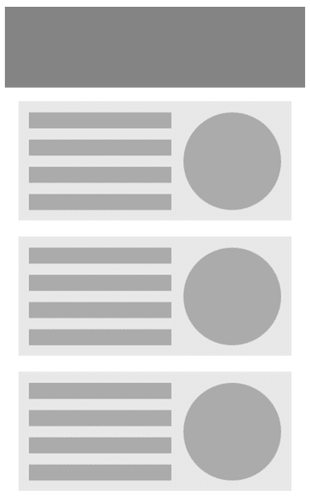
However, if you’re tasked with designing a site that needs large elements, you can use skeleton screens (like below) or relaxing background colors (e.g., blue gradients) while the visitor waits. Both of these solutions occupy users and decrease the chance that they’ll have a bad experience.
4. Building a complex layout
Organized and structured layouts are pleasing to the eye and work on a subconscious level. Studies show that 38 percent of users claim to leave a site if the content or the layout is unattractive. Furthermore, Gestalt principles of form perception suggest that users tend to look at the entire website at first rather than focusing on a single object.
Therefore, the site’s layout as a whole is more important than its individual parts. If your frontend is disorganized and the structure doesn’t make sense for your users, they will likely leave.
When tasked with designing a site’s layout, keep in mind that people tend to scan in an F-style pattern. This means that the most critical parts of your site are the far-left column and the top row. Make sure to insert the essential information in these sections.
5. Cluttering your site with content
A messy, information-filled webpage discourages visitors from staying on your site. This is where the Von Restorff effect comes to play. It suggests that items that stand out are more memorable. It’s much more difficult to utilize this psychological effect if the entire screen is full of visual elements or a wall of text.

Furthermore, if your design elements are all over the place, then the proximity principle, which suggests people perceive components near each other as related, doesn’t come into effect, resulting in even more confusion.
An uncluttered approach is also why many sites have moved toward a more minimalistic approach with an adequate amount of whitespace (figuratively speaking, it doesn’t necessarily have to be the color white). As a developer charged with design work, using more whitespace not only makes your site intuitive to follow, it likely means less work for you.
6. Displaying multiple CTAs
You might think that the more options your users have, the more likely they’ll find a suitable one. However, studies show that giving people multiple choices can create a choice overload, also known as a paradox of choice. So instead of choosing the most suitable option, they might not choose one at all.
Following the research, an essential suggestion is to create a page with a single call to action in mind. If your site has multiple CTAs, create separate pages to keep the user’s attention and eliminate the choice overload.
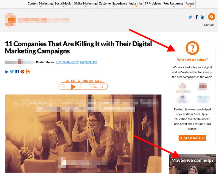
7. Using elements that look like banners
Last but not least, the Nielsen Norman Group’s research on banner blindness shows that users have learned to ignore content that is near ads, resembles ads, or appears in locations traditionally dedicated to ads. The most typical case is designing a call to action with a frame around it, which instantly looks like an advertisement.
Also, typical locations where your content can be perceived as an ad is on the right-hand column and in-between content (again, most likely surrounded by a frame).
Long story short, avoid designing your site’s elements to look like ads, or your visitors will ignore them.
Don’t let common mistakes hurt your site
If you're a frontend developer first, you might not be well-versed in web design. Don’t let that stop you from creating a winning design. Learning a few key psychological principles can help you avoid common web design mistakes; you, too, can create a design that achieves higher conversion and a better user experience.
While many other factors can influence the outcome of your users’ actions on the site, counting on psychological aspects is a great place to start for beginners and professionals alike.


