Neumorphism entails building a soft user interface in which the User Interface components are positioned behind the background rather than directly on it.
It gives the impression that background elements, such as buttons, are present but are only made visible by their projection. Neumorphism creates a continuous surface with bumps all through, giving the details the appearance of being inside the background and sticking out from beneath it. This design aesthetic focuses on contrast, intense colors, and skillfully applied shadows.
Glassmorphism, on the other hand, harnesses the unique properties of glass to improve designs by giving design elements a transparent or crystaline appearance. It centers attention on the desired content and aids in the addition of a visual hierarchy to your designs.
With neumorphism and glassmorphism, designers can maintain consistency with the way their designs look even as they design further.
Neumorphism in User Interfaces
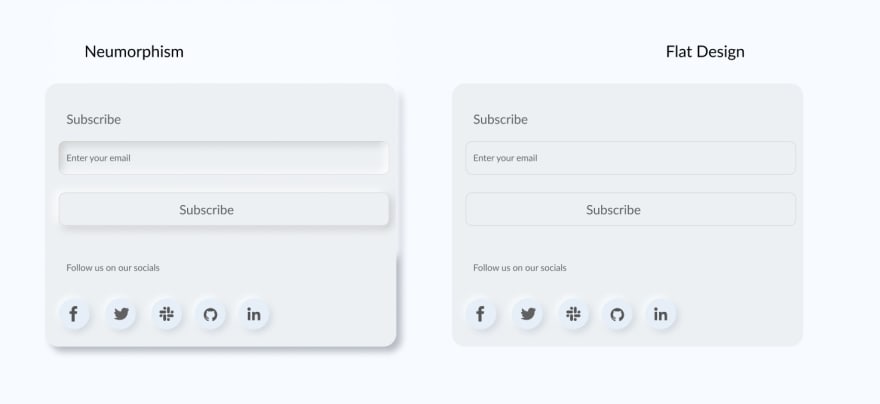
Neumorphism is a form of design that combines a monochromatic color scheme with shadows to give a design component a concrete appearance. Monochromatic refers to a color scheme comprised of variations of one color. The concept of neumorphism is inspired by combining both skeuomorphism and flat design, but birthing a new type of design that appears softer and better-looking.
Neumorphism gives user interface elements powerful yet subtle graphic effects by combining background colors, shadows, forms, gradients, and highlights to give a soft visual effect. It’s scalable and very consistent, so it streamlines and improves user interface. Neumorphism aids UI designers in maintaining visual consistency even as they design and create aesthetically pleasing experiences for the users. With neumorphism, UI elements appear more tangible in appearance, which, in turn, conveys an exemplary user interface and experience.
A completely white or black background would make distinguishing shadows challenging. Instead, we pick a shade of the color we want, preferably tinted. You need to experiment with colors and shadows to produce a neumorphic design.
There are two ways of implementing neumorphism:
     1. Drop shadow

    2. Inner shadow
Below is how they appear in UI:
Use Cases for Neumorphism in User Interface design
For user interfaces that use icons extensively, neumorphism is very advantageous because it gives a minimalist yet pleasing type of design that is catchy and user-friendly.
Here are some use cases for using neumorphism to create a more user-friendly UI:
Sign-up Pages
One of the many cases where neumorphism redefines user interfaces is on signup pages. Using neumorphism makes these page more flexible and user-friendly— instead of bland input fields, it appears new and appealing.
Random Buttons
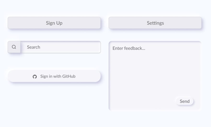
Let’s explore testing the efficiency of neumorphism using buttons. The tendency to blend into the background by having a background color that is the same or almost the same as the underlying element is a key attribute of a neumorphic interface. The primary objective of many buttons is to be distinguished from other elements. To achieve this, most buttons have a background color that keeps them distinct from other elements in the UI. Neumorphism plays a vital role in distinguishing buttons from other elements in a UI.
For example:
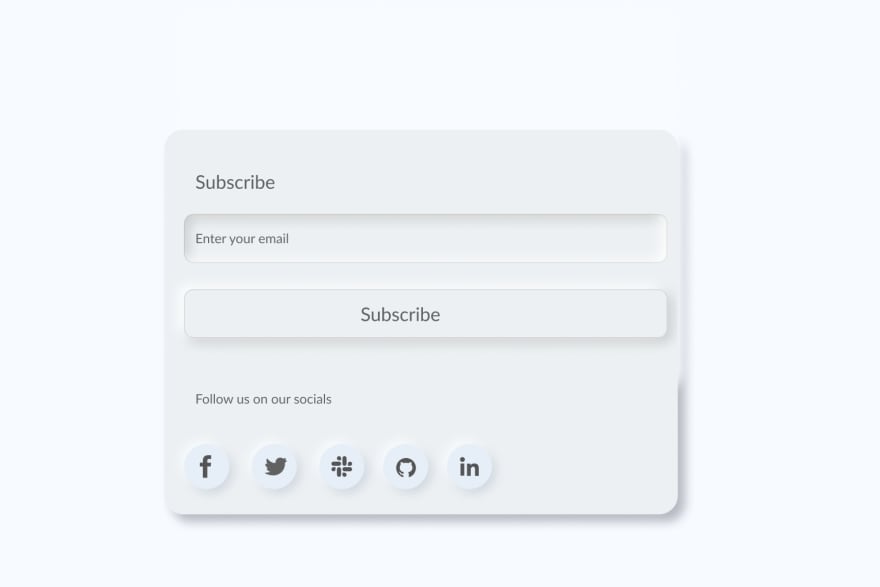
Call-to-Action Cards
Another use case for neumorphism is in call-to-action cards, which creates a simple yet classic effect. But, always remember to keep a balance between neumorphism and the user experience!
Requirements for Implementing Neumorphism
We must consider the following to correctly implement neumorphism in our User Interface:
- Neumorphism relies heavily on combining background colors, shadows, gradients, and highlights to give a soft visual effect. The background color must be the same as the element color.
- The box-shadow property is responsible for implementing neumorphism in CSS.
- The box shadow adds a dark shadow to one side of the element and, on the other side, a lighter shadow.
- Neumorphism requires one color with different shadows, tints, or hues to be implemented accurately.
- The edges are usually curved.
Implementing Neumorphism with CSS
The box-shadow property is responsible for a neumorphic effect. It is relatively easy to create neumorphism in CSS, taking note of the following: the upper left corner is a light shadow, and the lower right corner is a dark shadow.
First, let’s look at how the box-shadow property works, and then we’ll add neumorphic effects on elements, form fields, and buttons.
The Syntax
box-shadow: [horizontal offset][vertical offset][blur radius][spread radius][color][inset][initial][inherit];
- Horizontal offset: A positive value puts the shadow on the right side of the box, a negative value puts the shadow on the left side.
- Vertical offset: A positive value puts the shadow below the box, and a negative value puts the shadow above the box.
- Blur radius: The higher the number, the more blurred the shadow will be, and the lower the number, the less blurred it will be.
- Spread radius: A positive value increases the size of the shadow, and a negative value decreases the size of the shadow.
- Color: If the color is not specified, the shadow will not b displayed.
- Inset: Changes the shadow from an outer shadow to an inner shadow
- Initial: Sets the property to its default value.
- Inherit: Inherits the property from its parent element.
The box-shadow property can be written in the following ways:
box-shadow: 10px 8px 8px 10px #000000;
box-shadow: 5px 8px inset;
Creating a Neumorphic Element
HTML
<div class="element">
</div>
CSS
.element {
 align-items: center;
 background-color: #ecf0f3;
 box-shadow: 12px 12px 16px 0 #b5bbc2, -8px -8px 12px 0 #f8fbff;
 border-radius: 20px;
 display: flex;
 height: 410px;
 justify-content: center;
 margin-right: 4rem;
 width: 547px;
}
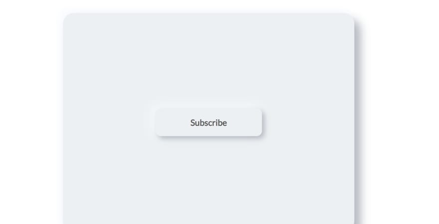
Output
Buttons
The code sample below shows how to style a user interface button in the neumorphic method.
HTML
<div class="element">
  <div class="enter">
    <p>Subscribe</p>
  </div>
CSS
body {
 align-items: center;
 display: flex;
 height: 100vh;
 justify-content: center;
}
.enter {
 align-items: center;
font-weight: bold;
 background-color: #ecf0f3;
 box-shadow: 5px 5px 10px 0 #b5bbc2, -5px -5px 20px 0 #f8fbff;
 border-radius: 10px;
 display: flex;
 height: 10px;
 width: 100px;
 color: #545454;
 padding: 1.3rem;
 justify-content: center;
}
Output
HTML
<div class="buttons">
<svg xmlns="http://www.w3.org/2000/svg" fill="none" viewBox="0 0 24 24" stroke-width="1.5" stroke="currentColor" class="icon">
  <path stroke-linecap="round" stroke-linejoin="round" d="M15.182 15.182a4.5 4.5 0 01-6.364 0M21 12a9 9 0 11-18 0 9 9 0 0118 0zM9.75 9.75c0 .414-.168.75-.375.75S9 10.164 9 9.75 9.168 9 9.375 9s.375.336.375.75zm-.375 0h.008v.015h-.008V9.75zm5.625 0c0 .414-.168.75-.375.75s-.375-.336-.375-.75.168-.75.375-.75.375.336.375.75zm-.375 0h.008v.015h-.008V9.75z" />
</svg>
</div>
<div class="buttons">
<svg xmlns="http://www.w3.org/2000/svg" fill="none" viewBox="0 0 24 24" stroke-width="1.5" stroke="currentColor" class="icon">
  <path stroke-linecap="round" stroke-linejoin="round" d="M6.75 3v2.25M17.25 3v2.25M3 18.75V7.5a2.25 2.25 0 012.25-2.25h13.5A2.25 2.25 0 0121 7.5v11.25m-18 0A2.25 2.25 0 005.25 21h13.5A2.25 2.25 0 0021 18.75m-18 0v-7.5A2.25 2.25 0 015.25 9h13.5A2.25 2.25 0 0121 11.25v7.5" />
</svg>
</div>
<div class="buttons">
<svg xmlns="http://www.w3.org/2000/svg" fill="none" viewBox="0 0 24 24" stroke-width="1.5" stroke="currentColor" class="icon">
  <path stroke-linecap="round" stroke-linejoin="round" d="M9 12.75L11.25 15 15 9.75M21 12c0 1.268-.63 2.39-1.593 3.068a3.745 3.745 0 01-1.043 3.296 3.745 3.745 0 01-3.296 1.043A3.745 3.745 0 0112 21c-1.268 0-2.39-.63-3.068-1.593a3.746 3.746 0 01-3.296-1.043 3.745 3.745 0 01-1.043-3.296A3.745 3.745 0 013 12c0-1.268.63-2.39 1.593-3.068a3.745 3.745 0 011.043-3.296 3.746 3.746 0 013.296-1.043A3.746 3.746 0 0112 3c1.268 0 2.39.63 3.068 1.593a3.746 3.746 0 013.296 1.043 3.746 3.746 0 011.043 3.296A3.745 3.745 0 0121 12z" />
</svg>
</div>
<div class="buttons">
<svg xmlns="http://www.w3.org/2000/svg" fill="none" viewBox="0 0 24 24" stroke-width="1.5" stroke="currentColor" class="icon">
  <path stroke-linecap="round" stroke-linejoin="round" d="M12 6v6h4.5m4.5 0a9 9 0 11-18 0 9 9 0 0118 0z" />
</svg>
</div>
<div class="buttons">
<svg xmlns="http://www.w3.org/2000/svg" fill="none" viewBox="0 0 24 24" stroke-width="1.5" stroke="currentColor" class="icon">
  <path stroke-linecap="round" stroke-linejoin="round" d="M10.343 3.94c.09-.542.56-.94 1.11-.94h1.093c.55 0 1.02.398 1.11.94l.149.894c.07.424.384.764.78.93.398.164.855.142 1.205-.108l.737-.527a1.125 1.125 0 011.45.12l.773.774c.39.389.44 1.002.12 1.45l-.527.737c-.25.35-.272.806-.107 1.204.165.397.505.71.93.78l.893.15c.543.09.94.56.94 1.109v1.094c0 .55-.397 1.02-.94 1.11l-.893.149c-.425.07-.765.383-.93.78-.165.398-.143.854.107 1.204l.527.738c.32.447.269 1.06-.12 1.45l-.774.773a1.125 1.125 0 01-1.449.12l-.738-.527c-.35-.25-.806-.272-1.203-.107-.397.165-.71.505-.781.929l-.149.894c-.09.542-.56.94-1.11.94h-1.094c-.55 0-1.019-.398-1.11-.94l-.148-.894c-.071-.424-.384-.764-.781-.93-.398-.164-.854-.142-1.204.108l-.738.527c-.447.32-1.06.269-1.45-.12l-.773-.774a1.125 1.125 0 01-.12-1.45l.527-.737c.25-.35.273-.806.108-1.204-.165-.397-.505-.71-.93-.78l-.894-.15c-.542-.09-.94-.56-.94-1.109v-1.094c0-.55.398-1.02.94-1.11l.894-.149c.424-.07.765-.383.93-.78.165-.398.143-.854-.107-1.204l-.527-.738a1.125 1.125 0 01.12-1.45l.773-.773a1.125 1.125 0 011.45-.12l.737.527c.35.25.807.272 1.204.107.397-.165.71-.505.78-.929l.15-.894z" />
  <path stroke-linecap="round" stroke-linejoin="round" d="M15 12a3 3 0 11-6 0 3 3 0 016 0z" />
</svg>
</div>
CSS
body {
 align-items: center;
 display: flex;
 height: 100vh;
 justify-content: center;
}
.buttons{
 margin-top:100px;
 border-radius:50%;
 width:48px;
 height:48px;
 background-color:#E0E5EC;
 box-shadow: 9px 9px 16px #b5bbc2 , -9px -9px 16px #f8fbff;
 display: flex;
margin: 20px;
}
.icon{
 color: #545454;
 width: 24px;
 height: 24px;
 margin: auto;
}
Output
Combining the various elements above makes for a cooler and much more user-friendly User Interface when used correctly by combining the right colors, shadows, and tints, as discussed earlier.
More Use Cases of Neumorphism in User Interface
Alert Pages
Buttons
Call-to-Action Forms/Pages
Sign-Up pages
User Interface Design with Glassmorphism
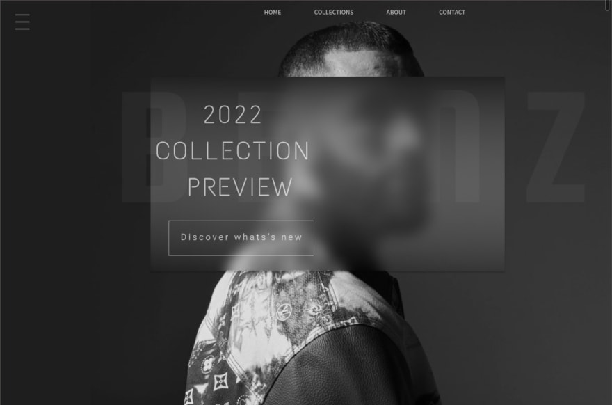
Glassmorphism imitates the look of tinted glass or a translucent background with a beautiful border and shadow. The user interface elements frequently sit above a contrasting background and give the impression that they are mounted on sheets of glass. Glassmorphism is increasingly popular and probably won't go away anytime soon.
Here is an example:
Simple shapes that float over blurry backgrounds with contrasting colors produce the best results when designed with glassmorphism. The hue and transparency can be selected from light or dark mode as a useful tool for web or app development.
Glassmorphism helps establish a hierarchy because of the addition of sufficient contrast and the differentiation of various User Interface elements.
However, overusing glassmorphism in the UI might make it less user-friendly.
Use Cases for Glassmorphism in User Interface Design
A use case for the glassmorphism effect is in the unlock screen of iOS phones. This effect gives it transparency and blurs the background color causing a remarkable impact on the entire screen and another on the buttons.
There is always a balance between the background blurring, the shadows, and the element's transparency with the glassmorphic effect. Also, remember that simple figures floating over blurry backgrounds with contrasting colors produce the best results in glassmorphism design.
Another good example is the use case shown below:
Glassmorphism solely depends on the blur effect, so borders give the design more definition and distinguish the element from the background. The transparent effect helps boost the overall appearance of the user interface design itself. The use of colorful backgrounds plays a huge role in glassmorphic design because when an element is placed over it, it highlights it well.
Attributes/Properties of Glassmorphism
The purpose of implementing glassmorphism is to make a balance between these elements in your user interface:
- Transparency: The key requirement for implementing glassmorphism is transparency. The element must be made for the top to attract more light and give a transparent effect to improve transparency.
- Blurred background: The blur makes the background image seamlessly blend into the background while still giving an aesthetically pleasing appearance; this is what is remarkable about the idea of glassmorphism. The transparent layers are carefully and correctly positioned over the blurred background. The blurred background also helps give the foreground a glassy look.
- Border: A border surrounding the glassmorphic element highlights it.
Implementing Glassmorphism with CSS
The key to creating an ideal glassmorphism effect is choosing the appropriate transparency. Only the fill should be translucent; the form itself shouldn't be. You will achieve a true background blur in this manner.
The following properties are employed to create the glassmorphism effect:
background: linear-gradient()
box-shadow:(values) rgba();
backdrop-filter: blur();
Glassmorphism needs a compelling aesthetic element in the user interface to provide the greatest visual impact. This element might be a picture or a shape.
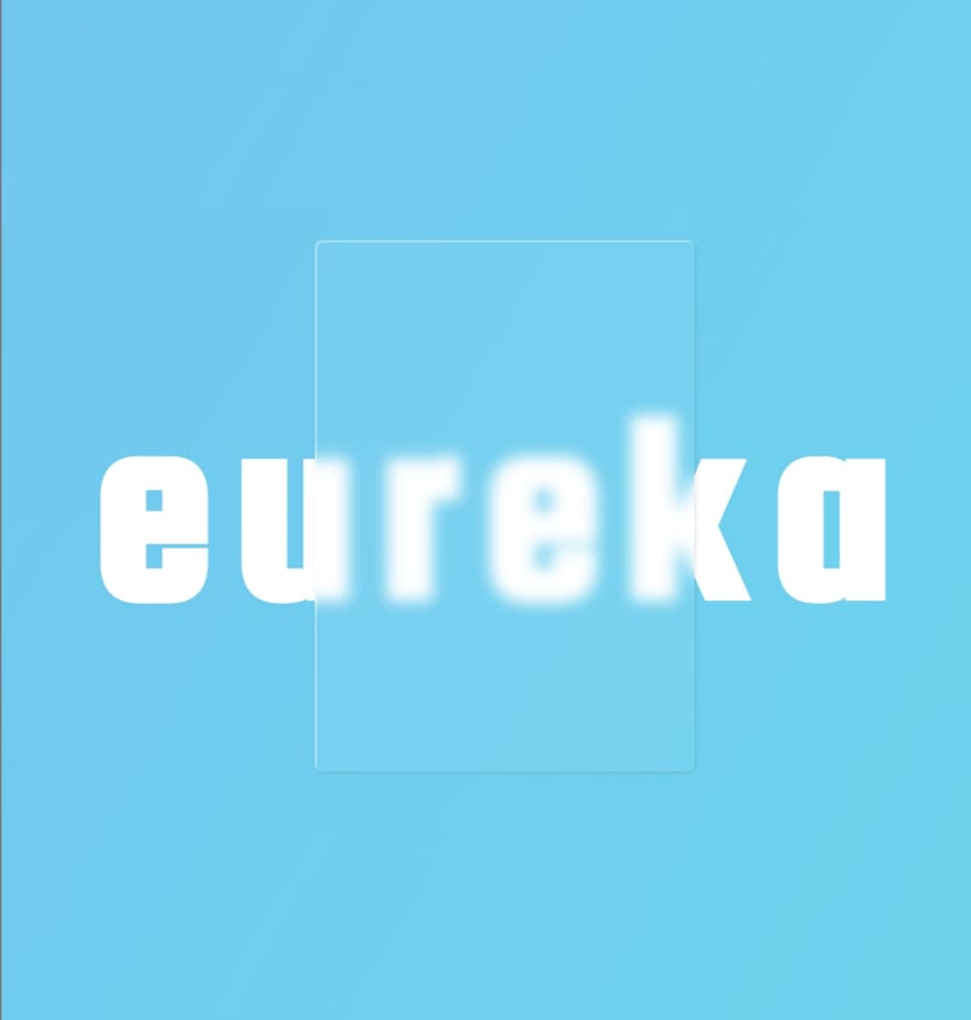
Creating a Glass Pane for Your User Interface Design
HTML
<div class="card">
  </div>
  <h1>eureka</h1>
CSS
body {
 display: flex;
 align-items: center;
 justify-content: center;
 height: 100vh;
 background-image: linear-gradient(120deg, #72C6EF 0%, #6DD5ED 100%);
 font-family:squada one;
}

h1 {
 position: absolute;
 z-index: 1;
 font-size: 200px;
 letter-spacing: 15px;
 color: #fff;
}
.card {
 width:250px;
 height: 350px;
 z-index: 2;
 background: rgba(255, 255, 255, 0.05);
 box-shadow: 0 8px 32px 0 #1f26875e;
 box-shadow: inset 1px 1px 0.12px #ffffff66,
 1px 1px 3px #0000001a;
 backdrop-filter: blur(5px);
 -webkit-backdrop-filter: blur(10px);
 border-radius:5px;
 border: 0.5px #ffffff2e;
}
Output
Pagination
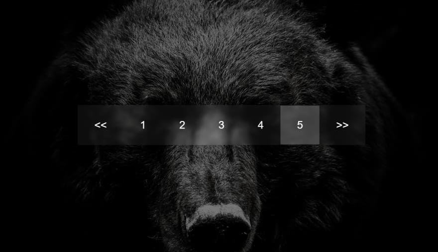
Another great way to implement glassmorphism is in pagination; glassmorphic objects partially allow you to see the image or colors behind them. The object or element is kept from merging into the background by adding a blur behind it. This blurriness is necessary to keep the text readable, one of the more important elements of user interface design.
HTML
<!DOCTYPE html>
<html lang="en">
<head>
  <meta charset="UTF-8">
  <meta http-equiv="X-UA-Compatible" content="IE=edge">
  <meta name="viewport" content="width=device-width, initial-scale=1.0">
  <link rel="stylesheet" href="style.css" />
  <title>Pagination</title>
</head>
<body>
  <div class="element">
    <ul class="pagination">
      <li>
        <a href="link"><<</a>
      </li>
      <li>
        <a href="link">1</a>
      </li>
      <li>
        <a href="link">2</a>
      </li>
      <li>
        <a href="link">3</a>
      </li>
      <li>
        <a href="link">4</a>
      </li>
      <li class="active">
        <a href="link">5</a>
      </li>
      <li>
        <a href="link">>></a>
      </li>
    </ul>
  </div>
</body>
</html>
CSS
* {
 margin: 0;
 padding: 0;
 font-family: sans-serif;
}
.element{
 position: relative;
 height: 50vh;
 width: 100%;
 background: linear-gradient(rgba(0, 0, 0, 0.5), rgba(0, 0, 0, 0.5)),
 url(leonhard-niederwimmer-rdVmRUlD0p8-unsplash.jpg);
 background-size: cover;
 background-position: center;
 display: flex;
 align-items: center;
 justify-content: center;
}
.element .pagination {
 position: relative;
 height: 60px;
 background: rgba(255, 255, 255, 0.05);
 box-shadow: 5px 5px 30px rgba(0, 0, 0, 0.3);
 display: flex;
 align-items: center;
 justify-content: center;
 backdrop-filter: blur(3px);
 border-radius: 2px;
}
.element .pagination li {
 list-style-type: none;
 display: inline-block;
}
.element .pagination li a {
 position: relative;
 padding: 20px 25px;
 text-decoration: none;
 color: #fff;
 font-weight: 500;
}
.element .pagination li a:hover,
.element .pagination li.active a {
 background: rgba(255, 255, 255, 0.2);}
Output
More Use Cases of Glassmorphism in User Interface Design
Glassmorphism needs a compelling aesthetic element to provide the greatest visual impact. This might be a picture or a shape.
Call-to-Action Cards
As shown above, the glassmorphic effect is over two photos, or on a bright background made of shapes that are clear and compelling and makes the glassy effect more pronounced.
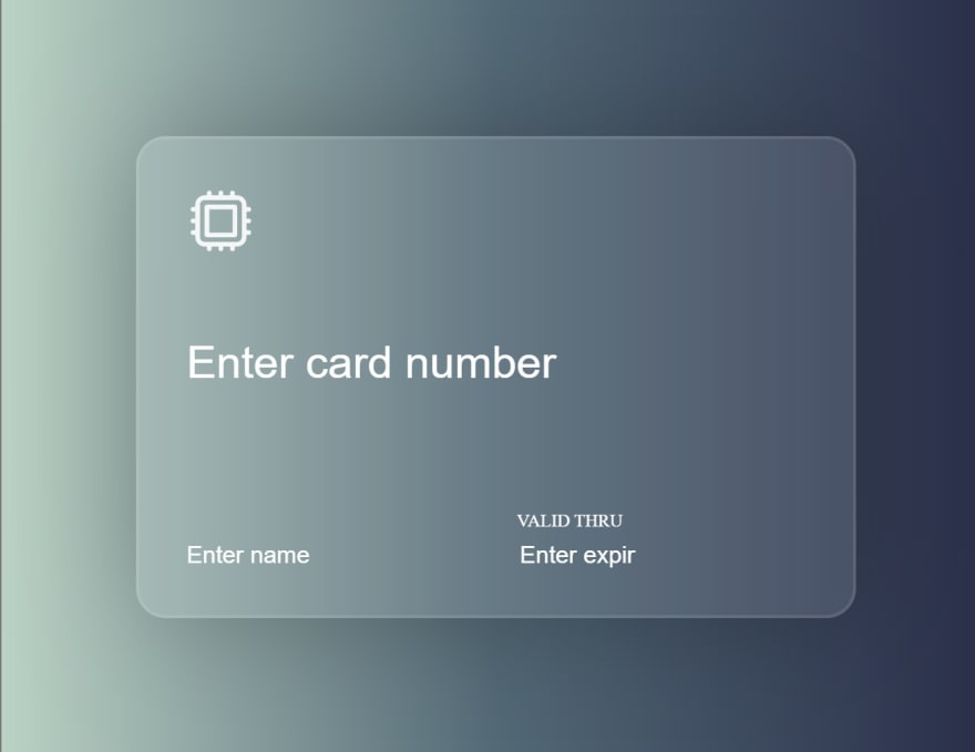
Let’s look at another example of the glassmorphic concept with the frosted glass effect used in the user interface of a credit card application page.
First, let's create the background using the background property:
body {
 background: linear-gradient();
HTML
<!DOCTYPE html>
<html lang="en">
<head>
  <meta charset="UTF-8">
  <meta http-equiv="X-UA-Compatible" content="IE=edge">
  <meta name="viewport" content="width=device-width, initial-scale=1.0">
  <link rel="preconnect" href="https://fonts.googleapis.com">
<link rel="preconnect" href="https://fonts.gstatic.com" crossorigin>
<link href="https://fonts.googleapis.com/css2?family=Inter:wght@400;500;600&display=swap" rel="stylesheet">
  <link rel="stylesheet" href="style.css" />
  <title>GLASSMORPHISM</title>
</head>
<body>
</body>
</html>
CSS
* {
 margin: 0;
 padding: 0;
 box-sizing: border-box;
}
body {
 background: linear-gradient(to right, #bbd2c5, #536976, #292e49);
 height: 100vh;
}
Let’s add the glassmorphism effect as we create the credit card. But first, let’s add a few more details to the HTML.
HTML
<!DOCTYPE html>
<html lang="en">
<head>
  <meta charset="UTF-8">
  <meta http-equiv="X-UA-Compatible" content="IE=edge">
  <meta name="viewport" content="width=device-width, initial-scale=1.0">
  <link rel="preconnect" href="https://fonts.googleapis.com">
<link rel="preconnect" href="https://fonts.gstatic.com" crossorigin>
<link href="https://fonts.googleapis.com/css2?family=Inter:wght@400;500;600&display=swap" rel="stylesheet">
  <link rel="stylesheet" href="style.css" />
  <title>GLASSMORPHISM</title>
</head>
<body>
<div class="container">

    <div class="card">
      <form>
        <div class="logo"><svg xmlns="http://www.w3.org/2000/svg" fill="none" viewBox="0 0 24 24" stroke-width="1.5" stroke="currentColor" class="w-6 h-6">
          <path stroke-linecap="round" stroke-linejoin="round" d="M8.25 3v1.5M4.5 8.25H3m18 0h-1.5M4.5 12H3m18 0h-1.5m-15 3.75H3m18 0h-1.5M8.25 19.5V21M12 3v1.5m0 15V21m3.75-18v1.5m0 15V21m-9-1.5h10.5a2.25 2.25 0 002.25-2.25V6.75a2.25 2.25 0 00-2.25-2.25H6.75A2.25 2.25 0 004.5 6.75v10.5a2.25 2.25 0 002.25 2.25zm.75-12h9v9h-9v-9z" />
        </svg>
        </div>
        <div class="number">
          <input id="number" placeholder="Enter card number" type="text" required maxlength="19">

        </div>
        <br>
        <div >
          <div class="name">
            <u><input id="name" placeholder="Enter name" type="text" required>
            </u>
          </div>
          <div class="expiry">

            <label>VALID THRU</label>
            <u><input id="card-exp" placeholder="Enter expiry" type="text" required maxlength="17" >
            </u>
          </div>

        </div>
      </form>
    </div>
  </div>
</div>
</body>
</html>
CSS
To implement it with CSS, we do the following:
body {
 background: linear-gradient(to right, #bbd2c5, #536976, #292e49);
 height: 100vh;
 display: flex;
 align-items: center;
 justify-content: center;
 color: #ffffff;
}

.card {
 height: 260px;
 width: 420px;
 border-radius: 20px;
 background: rgba(255, 255, 255, 0.1);
 backdrop-filter: blur(35px);
 border: 2px solid rgba(255, 255, 255, 0.1);
 box-shadow: 0 0 80px rgba(0, 0, 0, 0.25);
 padding: 30px 30px 30px 30px;
 overflow: hidden;

}
.logo{
 padding-bottom: 40px;
 opacity: 0.9;
 width: 50px;
}
.group{
 display: inline-flex;
 margin: 0;
 padding: 0;

}
.number{
 position:relative;
 display: inline-block;
 overflow: hidden;
 margin-bottom:70px;
}
.underline{
 transition: all 0.3s;
 display: inline-block;
 bottom: 0;
 left: -100%;
 position: absolute;
 width: 100%;
 height: 2px;
 background-color: #ffffff;
}


.name{
padding: 0px 80px 0px 0px;
 margin-right: 40px;
 width: 100px;
 position:relative;
 display: inline-block;
 overflow: hidden;
}
.expiry{
 padding: 0px 0px 0px 0px;
 margin-right: 60px;
 width: 80px;
 /* position:relative;  */
 display: inline-block;
 overflow: hidden;
}
label {
 color: white;
 font-size:12px;
 font-weight:normal;
 pointer-events:none;
 display: block;
 padding-bottom: 2px;
}

input {
 border: none;
 font-size: 16px;
 height: 26px;
 color: #ffffff;
 background: 0;
}
input:focus{
 border-bottom: 2px solid;
 outline: none;
 border: none;
 font-size: 16px;
 height: 30px;
 margin-bottom: -2px;
}
input:hover{
 border-bottom: 2px solid;
 color: none;
 margin-bottom: -2px;
 font-size: 16px;
 height: 30px;
}

input[id="number"]{
 font-size: 30px;
 width: 100%;
 height: 50px;
}
input[id="number"]::placeholder{
 font-size: 30px;
}
input::placeholder{
 color: #ffffff;
}
Output
Browser Compatibility
Neumorphism is compatible with the latest forms of Chrome, Edge, Firefox, and Safari, and according to caniuse.com, glassmorphism is supported by most, if not all, browsers.
Conclusion
Neumorphism is a visually pleasant concept of User Interface design and a popular trend more and more designers and developers are using to enhance user interfaces. It makes user interfaces more usable and aesthetically pleasing to users, although it can be a huge UI drawback when overused. Neumorphism takes cues from both skeuomorphism and flat design. These design philosophies aim to eliminate any flashy elements from the user interface and replace them with a soft look that is consistent throughout a project.
It's a wonderful idea to use neumorphism while creating icons, social buttons, forms, and pagination in the right way with the right color shade combinations. Employing neumorphism lessens the possibility of adopting color schemes that clash, as some people find color combinations difficult.
Glassmorphism has become more useful than most of the other recent styles. Glassmorphism has a shadow feature that elevates the element and provides it the appearance of floating above the surface. As a result, while interacting with the User Interface, the user can subconsciously develop a sense of hierarchy. Although it keeps the UI very sleek and classy, apply glassmorphism to only a few elements of your designs to avoid overuse. Try some neumorphic or glassmorphic effects in your designs today and see the difference they make.


