 Temani Afif
After the scalable one-line typewriter and the crazy "scrabble"-writer let's do another one: The multi-line typewriter.
A CSS-only solution of course:
The effect relies on using a Monospace font and knowing the number of characters. Yes, I am starting with the drawbacks but that was the price for a generic and easy-to-use code.
The HTML is very basic:
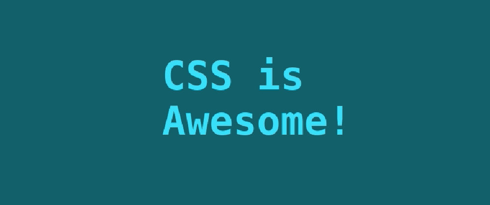
This is a <span class="type" style="--n:53">CSS only solution for a multi-line typewriter effect.</span>
A span with our text and the number of characters as a variable.
For the CSS:
.type {
  font-family: monospace;
  color:#0000;
  background:
    linear-gradient(-90deg,#00DFFC 5px,#0000 0) 10px 0,
    linear-gradient(#00DFFC 0 0) 0 0;
  background-size:calc(var(--n)*1ch) 200%;
  -webkit-background-clip:padding-box,text;
  background-clip:padding-box,text;
  background-repeat:no-repeat;
  animation:
    b .7s infinite steps(1),
    t calc(var(--n)*.3s) steps(var(--n)) forwards;
}
@keyframes t{
  from {background-size:0 200%}
}
@keyframes b{
  50% {background-position:0 -100%,0 0}
}
A few lines of CSS code with no hard-coded values. We only need to update the variable --n.
How does it work?
The trick relies on background properties so as a reference I always recommend this article:


We have two background layers. The first layer will color the text and the second one will create the blinking caret.
The idea of the first layer is to apply a discrete animation of background-size to create a filling effect from the first character to the last one using a gradient coloration.
Here is a step-by-step illustration to understand the trick:
The second layer is our caret. Here we will perform two animations. The first one is a background-size animation similar to the text coloration since the caret needs to follow the text. The second one is a background-position animation to create the blinking effect.
Another step-by-step to understand:
The width of the caret is controlled by the 5px inside the gradient and we add a small offset (10px) to avoid having an overlap with the text animation.
That's it! Simply imagine both layers animating at the same time and we have our CSS-only typewriter effect.
✔️ No Javascript
✔️ A basic HTML code
✔️ No complex CSS code. Less than 10 declarations and no hard-coded values
✔️ Accessible. The text is written within the HTML code (no pseudo-element, no duplicated text)
❌ Require a monospace font
⚠️ You can use any text without changing the code but you have to update one variable