 Temani Afif
Find out more CSS tricks at css-tip.com
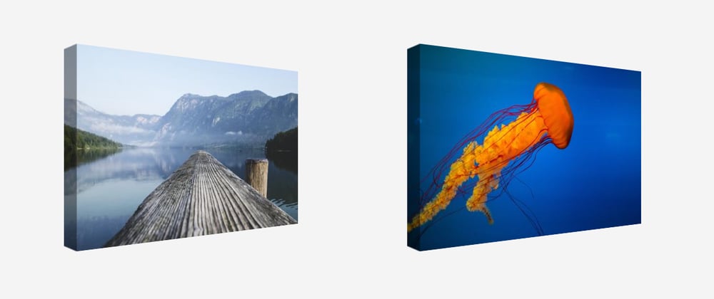
A quick trick to create a 3D illustration using only an <img> tag. No pseudo elements, no extra tag, no SVG, Nothing! Only one tag and few lines of CSS.
Here you go
Let's dig into the code
img {
  --x:10px;
  --y:20px;
  clip-path:polygon( /* 4 */
       var(--y)              var(--y),  /* a */
       calc(100% - var(--y)) var(--y),  /* b */
       calc(100% - var(--y)) calc(100% - var(--y)), /* c */
       var(--y)              calc(100% - var(--y)), /* d */
       0 calc(100% - var(--x) - var(--y)), /* x */
       0 calc(var(--x) + var(--y))); /* y */
  transform:perspective(1000px) rotateY(40deg); /* 5 */
  outline: var(--y) solid rgba(0,0,0,0.4); /* 1 */
  outline-offset: calc(-1*var(--y)); /* 2 */
  padding:var(--y) var(--y) var(--y) 0; /* 3 */
}
img:hover { /* 6 */
  transform:perspective(1000px) rotateY(0deg);
  clip-path:polygon(
       var(--y)              var(--y), /* a */
       calc(100% - var(--y)) var(--y), /* b */
       calc(100% - var(--y)) calc(100% - var(--y)), /* c */
       var(--y)              calc(100% - var(--y)), /* d */
       var(--y)  calc(100% - var(--x) - var(--y)), /* x' */
       var(--y)  calc(var(--x) + var(--y))); /* y' */
}
Here is a step by step illustration to understand each line of code

I have nothing more to add than: Enjoy!
We can easily adjust the above to consider any direction. Here is for the bottom one:
I won't do the other directions, I will let you do it alone 😉


