 Temani Afif
You want a Typewriter effect for your text but you are lost within all the variations that use JS and the ones that use a complex CSS code.
Search no more! Here is a simple typewriter effect with only a few lines of CSS where you don't need to deal with any complex code. It's scalable and works with any kind of text.
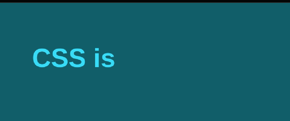
See it in play:
How does it work?
The logic is pretty simple and relies on a basic HTML code:
<span class="type"><span>CSS typewriter</span></span>
You put the text within two <span> and you are done. You don't need to deal with pseudo-element, duplicated texts, data-attribute, etc.
The CSS now:
.type {
  display:inline-flex;
}
.type span {
  word-break: break-all;
  height: 1.2em;
  width:0%;
  overflow: hidden;
  animation:t 2s linear infinite alternate;
}
.type span:before {
  content:" ";
  display:inline-block;
}
@keyframes t{
  90%,100% {width:100%}
}
No, I forget nothing. This is all the CSS needed for the typewriter effect.
3 tricks are used to achieve the final result:
1) cyclic percentage size
This is a powerful CSS quirk to calculate the width (or the height) of elements. I used a first <span> having display:inline-flex so its size depends on its content (it's an inline level element). The content inside (the other <span>) is using a percentage width so the width is based on its container. We have a cyclic calculation since each element depends on the other!
The Specification details such behavior. I don't recommend reading it because you will get lost (I had to read it 10 times to understand only a few cases).
I will try to use easy words to explain what is happening in our case.
- First the browser will ignore the percentage width to define the width of the container. The child element will have
width:auto. Our first span will have its width equal to the width of its child (so the width of the text). - Then the browser will get back to calculate the width of the child based on the width of the parent found previously BUT the width of the parent will not change again to not fall into an infinite loop.
In other words, the width:X% I am applying to the span is based on its own content that's why we don't need any complex calculation. Animating the element from 0% to 100% is all that we need.
This is what we get:
2) breaking the words
Now let's add word-break: break-all; to the previous code:
We are getting closer. Our text is wrapping letter by letter.
break-allBreaking is allowed within “words” ref
3) fix the height to one line
The final trick is to set the height of the element to be equal to one line. By default, the height of a line is around 1.2xfont-size that's why I using 1.2em. You have to adjust this value based on your case or based on the value of line-height (it should be equal to line-height)
That's it! we have our typewriter effect.
Wait, there is an issue with the first letter!
Yes, good catch. That's why in the initial code I am adding:
.type span:before {
  content:" ";
  display:inline-block;
}
This will create an invisible first letter that will take the place of the real first letter.
✔️ No Javascript
✔️ A basic HTML code
✔️ No complex CSS code. Less than 10 declarations and no hard-coded values
✔️ Accessible. The text is written within the HTML code (no pseudo-element, no duplicated text)
✔️ You can use any text you want without changing the code.
✔️ Doesn't require monospace fonts
✔️ No browser support issue. All the properties I am using are supported by most of the browsers. We can also remove the use of flexbox: https://codepen.io/t_afif/pen/VwWvmxe
❌ Doesn't support multi-line of text. Well, I need one drawback 😜
What about the caret?
You can easily add one using box-shadow:
What about multiple texts?
The above was only the first part of the "real" typewriter effect I am aiming for.
See it in play:
The HTML code is still a basic one:
I am <span class="type">
  <span>
    <span>a CSS Hacker</span>
    <span>an expert web developer</span>
    <span>a lazy person!</span>
  </span>
</span>
The CSS:
.type {
  display:inline-block;
}
.type > span {
  display:grid;
  overflow: hidden;
  height:1.2em;
}
.type span span {
  width:0%;
  max-width:max-content;
  overflow: hidden;
  height:inherit;
  word-break:break-all;
  animation:
    c 0.5s infinite steps(1),
    t 2s linear infinite alternate,
    m 12s steps(3) infinite;
}
.type span span:before {
  content:" ";
  display:inline-block;
}
@keyframes t{
  90%,100% {width:100%}
}
@keyframes c{
  0%,100%{box-shadow:5px 0 0 #0000}
  50%    {box-shadow:5px 0 0 red  }
}
@keyframes m{
  100% {transform:translateY(-300%)}
}
The trick is to make all the spans under each other (that's why I used display:grid on their parent container) so that the longest word will define the width of the main element.
Then each span will animate like previously. The only difference is that, with a small transform trick, I will show only one at a time.
If you remove the overflow:hidden from the second span you can see what is happening:
Notice the use of max-width:max-content to limit the caret to the width of the actual text and not the width of the main element.
You can also notice that 3 is used with many values:
- 12s = 3*(2*2s)
- steps(3)
- translateY(-300%) = translateY(3*-100%)
Yes, that value can be a CSS variable. Our code will become scalable and we can easily add as much text as we want:
We have our scalable CSS only Typewriter Effect:
✔️ No Javascript
✔️ A basic HTML code
✔️ No complex CSS code
✔️ Accessible
✔️ Works with any text content
✔️ Can use any font
✔️ Scalable
✔️ No browser support issue


