 Temani Afif
Yes, another post about CSS loaders but this time you will build the loader! In this article, I will share with you a few tricks I used to build some of my loaders.
In case you have missed it, I created a collection of 500+ single div loaders where you will find 50 loading dots. We will see the magic behind some of them!
There are a lot of techniques to create loading dots. I will focus on my favorite one which is radial-gradient and background animation.
Well, another boring tutorial where we will have a ton of code, complex @keyframes, and insane animation delays, right?
No, at all. In this tutorial you will have:
✔️ One div
✔️ One @keyframes
✔️ No delay and No complex time calculation
✔️ We will not make one animation but many of them using the same code structure
✔️ Not boring because this article will end before you even have time to blink
1) Building the dot
We first create one dot using the following code (demo link):
.dot {
  background:radial-gradient(farthest-side,currentColor 90%,red);
  background-size:30px 30px;
  background-position:top center;
  background-repeat:no-repeat;
}

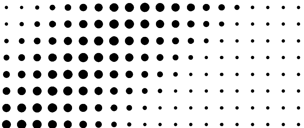
The logic is simple: I create a background layer having a size equal to 30x30 placed at the top center and I disable the repetition to have only one instance. That layer is a radial-gradient() having two colors, the currentColor which is the color you define within the color property (useful to update the dot coloration later), and a transparent color (I am using red here to see the limit of the gradient layer).
farthest-side allows me to consider the farthest side for my percentage reference and since we are dealing with a square gradient (30x30), all the sides are the farthest one so by using currentColor 100%, I draw a circle that touches the sides. no complex value like 66% or 72.5%.
But you are using 90%, not 100%!
True and this is because gradients aren't anti-aliasing so we have to consider a smaller value to have a smooth edge.
Below is a difference between 90% and 100%

That's all! Now, we have our dot so let's animate it.
2) Animating the dot
To animate the dot we simply animate the background-position. Let's create a @keyframes that update the position from top center to bottom center
Our code will become (demo link):
.dot {
  background:radial-gradient(farthest-side,currentColor 90%,#0000);
  background-size:30px 30px;
  background-position:top center;
  background-repeat:no-repeat;
  animation:m 1s infinite alternate;
}
@keyframes m{
  to {background-position:bottom center}
}
I think the above is self-explanatory
We can also transform the code like the one below. It will make things easier for the next steps.
.dot {
  background:radial-gradient(farthest-side,currentColor 90%,#0000);
  background-size:30px 30px;
  background-repeat:no-repeat;
  animation:m 1s infinite alternate;
}
@keyframes m{
  0%   {background-position:top    center}
  100% {background-position:bottom center}
}
Now you can animate one dot. All you have to do is to update the positions to whatever you want.
For anyone not familiar with background-position, I highly recommend reading my previous article and more precisely the section talking about the percentage values.
Later, I will consider percentage values instead of keywords like top center (which is equivalent to 50% 0). In my previous article, I am giving all the equivalence.
3) Adding more dots
To add more dots we simply add more divs placed next to each other. Then each one will have a background layer and its own @keyframes animation and...

Of course, NO!
To add more dots we simply add more background layers. We can have as many layers as we want so one div can hold a lot of dots!
Let's try with 2 (demo link):
.dot {
  background:
    radial-gradient(farthest-side,currentColor 90%,#0000),
    radial-gradient(farthest-side,currentColor 90%,#0000);
  background-size:30px 30px;
  background-repeat:no-repeat;
  animation:m 1s infinite alternate;
}
@keyframes m{
  0%  {background-position:top    left,bottom right}
  100%{background-position:bottom left,top    right}
}
One dot will animate from top left to bottom left and another one from bottom right to top right. As simple as that!
Notice that I am keeping only one background-size because all my dots will have the same size.
Let's optimize the code using CSS variable and percentage values (demo link):
.dot {
  --d:radial-gradient(farthest-side,currentColor 90%,#0000);
  background:var(--d),var(--d);
  background-size:30px 30px;
  background-repeat:no-repeat;
  animation:m 1s infinite alternate;
}
@keyframes m{
  0%  {background-position:0 0   ,100% 100%}
  100%{background-position:0 100%,100% 0   }
}
The variable --d will avoid the repetition of the same gradient syntax. For the percentage values, it's more a preference than an optimization. It is easier for me to deal with values than keywords.
Did you already blink?
No problem because we are almost done. We have all the ingredients to build any kind of loading dots.
4) Creating the loader
To build the loader you will first need a pen & paper. Yes, I am not joking. People tend to jump into their favorite Code Editor and start writing code trying to imagine in their head how things should work. No, no, it won't work that way.
You put everything on a paper and then you translate it into a code.
Step 1: define your structure
In this step, we decide about the number of dots, their size, the gaps, etc.
So let's say I will be using 4 dots having a size of 20x20 and a gap of 5px. This will give me a total width of 95px. I don't want them to jump a lot so let's have a height of 40px

Step 2: write the code
We translate what we defined in (1) into a code:
.dot {
  width:95px;
  height:40px;
  --d:radial-gradient(farthest-side,currentColor 90%,#0000);
  background:var(--d),var(--d),var(--d),var(--d);
  background-size:20px 20px;
  background-repeat:no-repeat;
}
Don't worry about the result you get so far. You will see only one dot because all of them are above each other. We didn't define any background-position yet.
Step 3: build your timeline
In this step, you need to use your imagination to define each frame of your full animation. Draw a step-by-step illustration of the animation you have in mind.
Here is an example where my animation will move all the dots from the bottom to the top one by one then move them back to the bottom.

I have 9 frames and it's important to note that the last one is the same as the first one to have a continuous animation.
Step 4: translate the timeline into background-positions
Now that you have your drawing, simply define the background-position for each frame. For each dot, we have a fixed X coordinate and only the Y will change.
For X, we have the following values: 0%, 33%, 66%, 100%. Not very intuitive so let's use another syntax: calc(0*100%/3), calc(1*100%/3), calc(2*100%/3), calc(3*100%/3). The logic is easy: N dots so we loop from 0 to N-1 and we divide by N-1.
The code for our animation will be:
@keyframes m {
  ??%{background-position:calc(0*100%/3) 100%, calc(1*100%/3) 100%, calc(2*100%/3) 100%, calc(3*100%/3) 100%}
  ??%{background-position:calc(0*100%/3) 0   , calc(1*100%/3) 100%, calc(2*100%/3) 100%, calc(3*100%/3) 100%}
  ??%{background-position:calc(0*100%/3) 0   , calc(1*100%/3) 0   , calc(2*100%/3) 100%, calc(3*100%/3) 100%}
  ??%{background-position:calc(0*100%/3) 0   , calc(1*100%/3) 0   , calc(2*100%/3) 0   , calc(3*100%/3) 100%}
  ??%{background-position:calc(0*100%/3) 0   , calc(1*100%/3) 0   , calc(2*100%/3) 0   , calc(3*100%/3) 0   }
  ??%{background-position:calc(0*100%/3) 100%, calc(1*100%/3) 0   , calc(2*100%/3) 0   , calc(3*100%/3) 0   }
  ??%{background-position:calc(0*100%/3) 100%, calc(1*100%/3) 100%, calc(2*100%/3) 0   , calc(3*100%/3) 0   }
  ??%{background-position:calc(0*100%/3) 100%, calc(1*100%/3) 100%, calc(2*100%/3) 100%, calc(3*100%/3) 0   }
  ??%{background-position:calc(0*100%/3) 100%, calc(1*100%/3) 100%, calc(2*100%/3) 100%, calc(3*100%/3) 100%}
}
It may look complex at first glance but it's very simple. Inside each frame, I define the position of each dot. The X is always the same and I update the Y from 0 (top) to 100% (bottom).
We have our @keyframes!
Step 5: find the percentage of the keyframes
The last step is to fill the ?? with percentage values. We have 9 frames so we consider 8 (always N-1) and we divide 100% by 8 to get 12.5%. We start for 0% and we increment by 12.5% until we reach 100%.
You are done!
Now put everything together and enjoy:
The only limit to this technique is your imagination. If you start playing with it you will find yourself creating a lot of fancy dot loaders.
You want more examples?
Ok, let's do two more.

This time I will consider 3 dots (always the same sizing) and the movement of each one is center -> top -> bottom -> center.
Notice the arrow in my drawing. It means that I want an alternate animation.

A 4 dots loader where I will update the X coordinate as well.
I think everyone got the idea 😉
Homework time!
Now, it's your turn to build a CSS loader, or even better a full collection of loaders! Share your creation in the comment section. 👇
I will highlight the best ones in my next article and will share them on Twitter.
Waiting for your CSS loaders!

Conclusion & self-promotion
The above is not the only technique I am using to build loading dots. There are more than this but putting everything into one article will make it hard to understand.
If you want a follow up to this article with more tricks don't forget to ❤🦄
You can also support me on patreon

For only 3€/month, you encourage me to provide more content
For 8€/month, you can become a better developer because you will have access to a private chat where you can ask me any CSS-related question at any time. I may also give you some of my secret tricks 🤫
For 20€/month, I can help you with any project you are working on!
You can also buy me a coffee