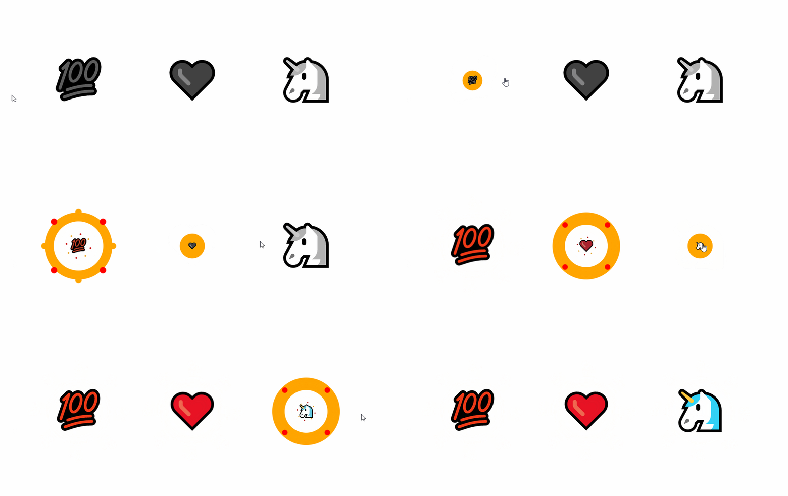
Like star rating, reaction components are something widely used in many websites so here I am with my own implementation: A CSS-only reaction component that works with emojis or any kind of custom icons.
No need to bother yourself dealing with SVG or PNG images. Grab your favorite emoji and build your own component.
See it in play:
In the above, you will find no @keyframes. All the animations are done using only CSS transition
How does it work?
The above rely on the very basic HTML code:
<input type="checkbox" id="r1">
<label for="r1" class="react">
<i data-icon="💯"></i>
</label>
Nothing complex. An <input> with its corresponding <label> and a <i> element having our Emoji as data attribute. That's it!
All the magic is done using CSS and we have different layers illustrated like below:
<input type="checkbox" id="r1">
<label for="r1" class="react">
  ::before [1]
  <i data-icon="💯">
    ::before [2]
    ::after [3]
  </i>
  ::after [4]
</label>
All the layers are above each other thanks to the use of display:inline-grid and grid-area:1/1
[1] is a basic circle created like below:
.react:before {
  content:"";
  grid-area:1/1;
  border-radius:50%;
  border:solid orange calc(var(--r)/2);
}
Its transition is a scale one (from 0 to 1) then a border-width (from calc(var(--r)/2) to 0)
transition:
    transform 0.5s,
    border-width 0.5s 0.5s;
--r is the variable that will control all the sizing of our component. Yes, it's a scalable one! You only need to adjust one variable to control the overall size.
[2] is our emoji. Nothing complex here:
.react i:before {
  content:attr(data-icon);
  grid-area:1/1;
  font-style:normal;
  font-size:calc(0.6*var(--r));
}
The fun start with [3] and [4]. Those small circles are built using multiple radial-gradient. The difference between [3] and [4] is the circle size and a small rotation to avoid the overlap:
.react:after,
.react i:after{
  content:"";
  grid-area:1/1;
  margin: calc(var(--r)/-2);
  --c1:radial-gradient(red    50%,#0000 60%);
  --c2:radial-gradient(orange 50%,#0000 60%);
  background:
    var(--c1),var(--c1),var(--c1),var(--c1),
    var(--c2),var(--c2),var(--c2),var(--c2);
  background-size:calc(var(--r)/6) calc(var(--r)/6);
  background-position:
    calc(50% - var(--r)/2) calc(50% - var(--r)/2),
    calc(50% + var(--r)/2) calc(50% - var(--r)/2),
    calc(50% - var(--r)/2) calc(50% + var(--r)/2),
    calc(50% + var(--r)/2) calc(50% + var(--r)/2),
    calc(50% +  0px) calc(50% + var(--r)*0.707),
    calc(50% + var(--r)*0.707) calc(50% +  0px),
    calc(50% - var(--r)*0.707) calc(50% +  0px),
    calc(50% +  0px) calc(50% - var(--r)*0.707);
  background-repeat:no-repeat;
  transform:scale(0);
}
.react i:after {
  background-size:calc(var(--r)/8) calc(var(--r)/8);
  transform:rotate(60deg) scale(0);
}
Each one is made with 8 circles (4 red & 4 orange) placed in a circular shape. The Math-folks will notice the value of sin() and cos() for the angles N*45deg.
Their transition is a scale one (from 0 to 1) then a background-size one (from the value defined above to 0) combined with opacity
transition:
    transform 0.5s 0.5s,
    opacity   0.4s 0.9s,
    background-size 0.5s 0.9s;
Finally, we have the transition applied to the <i> element that will affect both [2] and [3]. We have the filter one that allows us to have the grey coloration that transitions to the original color of the emoji and a scale one.
For the scale effect, I am using a magic cubic-bezier function to create a transition from 1 to 0 to 1.
  transition:
     filter .5s .5s,
     transform 1s cubic-bezier(0,26.67,.5,26.67);
I am detailing this technique in the below post:


Advanced CSS Animation Using cubic-bezier()
Temani Afif for This is Learning ・ May 19 '21
I am also adding a shake effect on hover where I am using another cubic-bezier detailed in the same post.
transition:transform 0.25s cubic-bezier(0.5,400,0.5,-400);
That's it!
All you have to do is to pick your emoji or an icon from Font Awesome and adjust the --r to control the size.
I made some trivial changes to the initial code to be able to use Font Awesome icons as we don't need to define content since the CSS of Font Awesome will do it for us.
PS: The idea was inspired by a Stack Overflow question I answered a while ago: How to make a sparkling button animation?. It's the same effect with a few adjustments to my old code.


