 Temani Afif
Find out more CSS tricks at css-tip.com
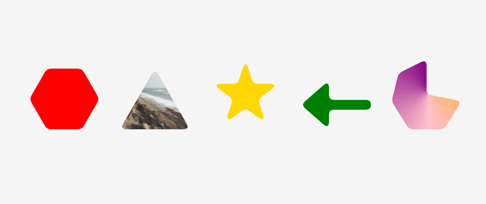
A quick trick to create any kind of shape having rounded corners.
1. Build the shape
For this task, we simply use clip-path. You can rely on the following tool to do it: https://bennettfeely.com/clippy/. You will find a lot of predefined shapes and you can build yours using drag & drop.

2. Round the corners
For this task we apply the following SVG filter:
<filter id="round">
  <feGaussianBlur in="SourceGraphic" stdDeviation="5" result="blur" />
  <feColorMatrix in="blur" mode="matrix" values="1 0 0 0 0 0 1 0 0 0 0 0 1 0 0 0 0 0 19 -9" result="goo" />
  <feComposite in="SourceGraphic" in2="goo" operator="atop"/>
</filter>
filter:url(#round);
That's it!
We can apply any kind of background to our shape. The shape is defined using pseudo-element because we cannot directly apply the filter to an element having clip-path. We need to apply it to a parent container.
We can also control the radius by adjusting the stdDeviation of the filter.
This trick is not only limited to clip-path shapes. It can also work with
Multiple elements shapes:
Multiple background shapes:
and so on.
Simply build your shape as you know and apply the filter to the uppermost container
The SVG filter is taking from the following article: https://css-tricks.com/gooey-effect/


