 Temani Afif
Find out more CSS tricks at css-tip.com
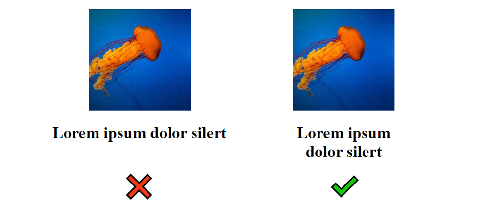
We all face such a requirement where we need to make a title below (or above) an image to not exceed the width of the image. In most of the cases, we need them to have the same width.
The common solutions are:
- Make the width of the title the same as the image: not a dynamic solution since we have to manually adjust the width each time we use a different image ❌
- Manually insert line break inside the title: Nah! a very bad idea ❌
- Make the title
position:absoluteto be able to usewidth:100%which will refer to a container that has the size of the image ... too complicated and it will make our text out of the flow ❌
Here is an easy solution to solve this task. No hardcoding width, no out of flow content and only few line of CSS:
<div class="box">
   <img>
   <h1>Lorem ipsum dolor ..</h1>
</div>
.box {
  display: inline-block;
}
h1 {
  width: 0;
  min-width: 100%;
}
Yes, that's it!
This trick relies on two things:
- We make the container (the
boxelement) a shrink-to-fit element (its width is defined by its content). I usedinline-blockbut it can be a float element, atableone, a flex item, etc. - We make our title have a
widthequal to0so it will not contribute to the container width. Our container will have its width defined only by the image. We addmin-width: 100%to resize our title and make its width equal to the container width (the one defined previously with the image!). Yes, it's a bit crazy or let's say magic 😉
Some working examples
In all the above examples, the image will dictate the width of the title.
This trick is not only limited to image + title. It can work with any kind of configuration where we want an element A to define the width of an element B
The title defines the width of the image
The title defines the width of a paragraph
I think everyone got the idea. There is no restriction and any kind of element (even one with complex content) can be considered for this trick.
We can extend the same logic to a column configuration to have one column defining the height of another one. This time we will rely on height:0; min-height:100%.
This one is a bit tricky since the usage or percentage height is not trivial (we all know the prophecy that says: "the parent needs to have an explicit height defined")
To overcome this, I will consider a CSS grid configuration where I don't need any explicit height.
Below, the left column is defining the size of the right one. The latter will get a scrollbar when its content exceeded the defined height.
From the specification we can read:
Once the size of each grid area is thus established, the grid items are laid out into their respective containing blocks. The grid area's width and height are considered definite for this purpose.
A grid item can safely use height:100% inside its grid area and that grid area will have its height defined based on the content and since one of them is having height:0, it will not contribute to that height (yes, the same magic as above 😉)
Flexbox can also be used here but we need an extra wrapper for the element that will use height:0;height:100%
We need the extra wrapper because we will rely on the stretch alignment of flex items to have our defined size that will be used as a reference for the percentage.
From the specification:
If the flex item has align-self: stretch, redo layout for its contents, treating this used size as its definite cross size so that percentage-sized children can be resolved.
One element will define the height of the parent, the other will get stretched by default to that height and the content inside will get sized to the same height.
Now, you have a magic trick to avoid unwanted overflow and keep elements equal in size even if they have different content.
Some StackOverflow posts where I am using this trick:
How to match width of text to width of dynamically sized image/title?
How can you set the height of an outer div to always be equal to a particular inner div?
You want to support me?

OR