 Temani Afif
Find out more CSS tricks at css-tip.com
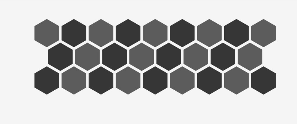
I know there is a ton of articles detailing how to create hexagon grid but how many of them are responsive? Only few of them and they rely on a lot of media query or JS.
Here is a CSS only solution to have a responsive hexagon grid that fit nicely into all the sreen sizes. No JS, no media query and no complex html code. Only few lines of CSS.
Here you go
Explanation
<div class="main">
  <div class="container">
    <div></div>
    <div></div>
    ...
  </div>
</div>
.main {
  --s: 100px;  /* size of a hexagon */
  --m: 4px;    /* space between each heaxgon */
  --r: calc(var(--s)*3*1.1547/2 + 4*var(--m));
  display:flex;
}
.container div {
  width: var(--s);
  height: calc(var(--s)*1.1547);
  margin: var(--m);
  display: inline-block;
  clip-path: polygon(0% 25%, 0% 75%, 50% 100%, 100% 75%, 100% 25%, 50% 0%);
  margin-bottom: calc(var(--m) - var(--s)*0.2885);
}
.container::before {
  content: "";
  width: calc(var(--s)/2 + var(--m));
  float: left;
  height: 100%;
  shape-outside: repeating-linear-gradient(
                  transparent 0 calc(var(--r) - 3px),
                  #fff        0 var(--r));
}
[main]
Nothing special here. A basic div where I am defining some CSS variables and it need to be a flexbox container.
[container]
No CSS here, this is our flex item that will allow us to use the height:100%.
[div]
Our hexagon item. The width/height are defined with the variable s (1.15 ~ 1/cos(30deg)). We use clip-path to create the hexagon shape ref. Finally we apply a margin-bottom to create the overlap with the next line ( 0.2885 ~ tan(30deg)/2).
Until now nothing complex. Let's move to the intresting part!
[container::before]
A floated pseudo element where I will apply shape-outside to allow the hexagon items to wrap around a particular shape creating the perfect indentation between lines.
A figure to illustrate:

It's trivial that our float element need to fill all the container thus the use of height:100%. Each "even" line of our grid need an indentation equal to half the width of an hexagon item plus a margin which will give us width:calc(var(--s)/2 + var(--m)).
We need to repeat the logic for each 2 lines and the height of 2 lines is 2 height of hexagon + 4 margin + 2 negative margin-bottom = 2xS/cos(30deg) + 4xM - 2xSxtan(30deg)/2
After some simplification we get (3xS)/(2xcos(30deg)) + 4xM and this is our r variable. The shape-outside will create a repeating gradient having transparent within [0, r - x] and non-transparent within [r - x, r].
The non-transparent part (illustrated by the blue rectangle) will push the elements of the second line creating our beautiful responsive behavior.
x can have any value but not too big to avoid pushing the first line too (1px should do the trick but to avoid rounding issue we use a bigger value).
That's It!
In addition to this being responsive, we can easily adjust the size of the hexagon items, the margin between them and since we are dealing with empty divs we can add any content inside.
Check the below post for more shapes:


