 Temani Afif
Find out more CSS tricks at css-tip.com
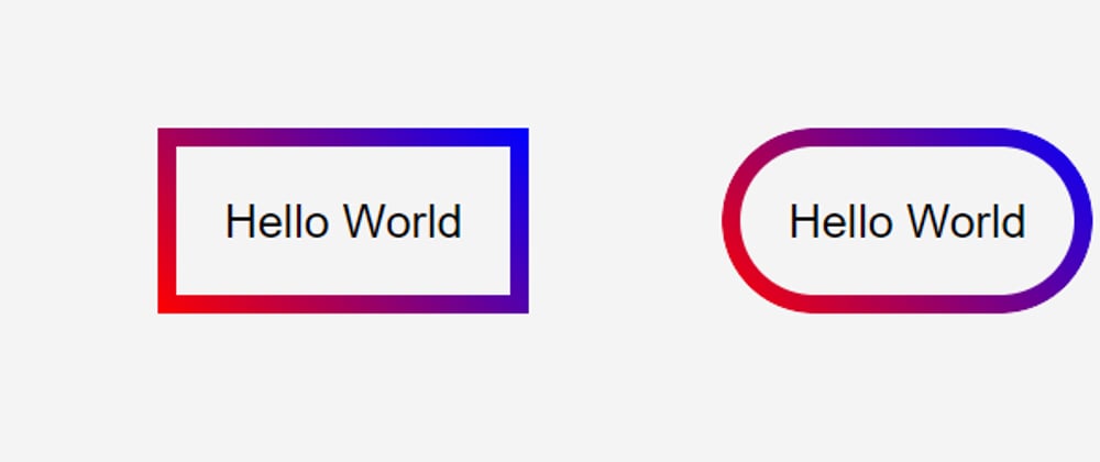
We all know the property border-image that allows us to add any kind of images (including gradients) as borders.
.box {
  border: 10px solid;
  border-image: linear-gradient(45deg,red,blue) 10;
}

Unfortunately, border-radius isn't supported with border-image and it's painful to find tricks to obtain rounded borders having a gradient.
Here is a trick that will produce such a result. No complex code, No SVG, or multiple elements are required! only two lines of CSS code using the mask property.
.box {
  border-radius: 50px; /*1*/
  border: 10px solid transparent; /*2*/
  background: linear-gradient(45deg,red,blue) border-box; /*3*/
  -webkit-mask: /*4*/
     linear-gradient(#fff 0 0) padding-box,
     linear-gradient(#fff 0 0);
  -webkit-mask-composite: xor; /*5'*/
          mask-composite: exclude; /*5*/
}

Explanation
(1)(2): Those lines are trivial.
(3): We apply a gradient as background and we make its origin the border box (by default it's the padding box).
(4): Using the mask property, we apply two opaque layers. The bottom one will cover the whole element and the top one will cover only the padding box (so it will not cover the border area)
(5): We exclude the top layer from the bottom one so that only the border area will be shown!
(5'): Some browsers still don't support mask-composite so we use the prefixed version.
That's it!
Now you can adjust the border, gradient, and radius as you want. The only drawback is that this will mask the content so we can move the code to a pseudo-element instead
.box {
  position: relative;
}
.box::before {
  content: "";
  position: absolute;
  inset: 0;
  border-radius: 50px;
  padding: 10px;
  background:linear-gradient(45deg,red,blue);
  -webkit-mask:
     linear-gradient(#fff 0 0) content-box,
     linear-gradient(#fff 0 0);
  -webkit-mask-composite: xor;
          mask-composite: exclude;
}

I replaced the border with padding to make the code shorter but the logic remains the same: we exclude the content area from the padding area so only padding will remain visible
Find more CSS Tips
StackOverflow - Border Gradient with Border Radius
StackOverflow - Button with transparent background and rotating gradient border